From Mario’s to Alba: A Restaurant Exterior Redesign
A deep blue-green exterior, a defined stone-toned entrance, and warm lighting give a familiar neighborhood restaurant a more composed identity.
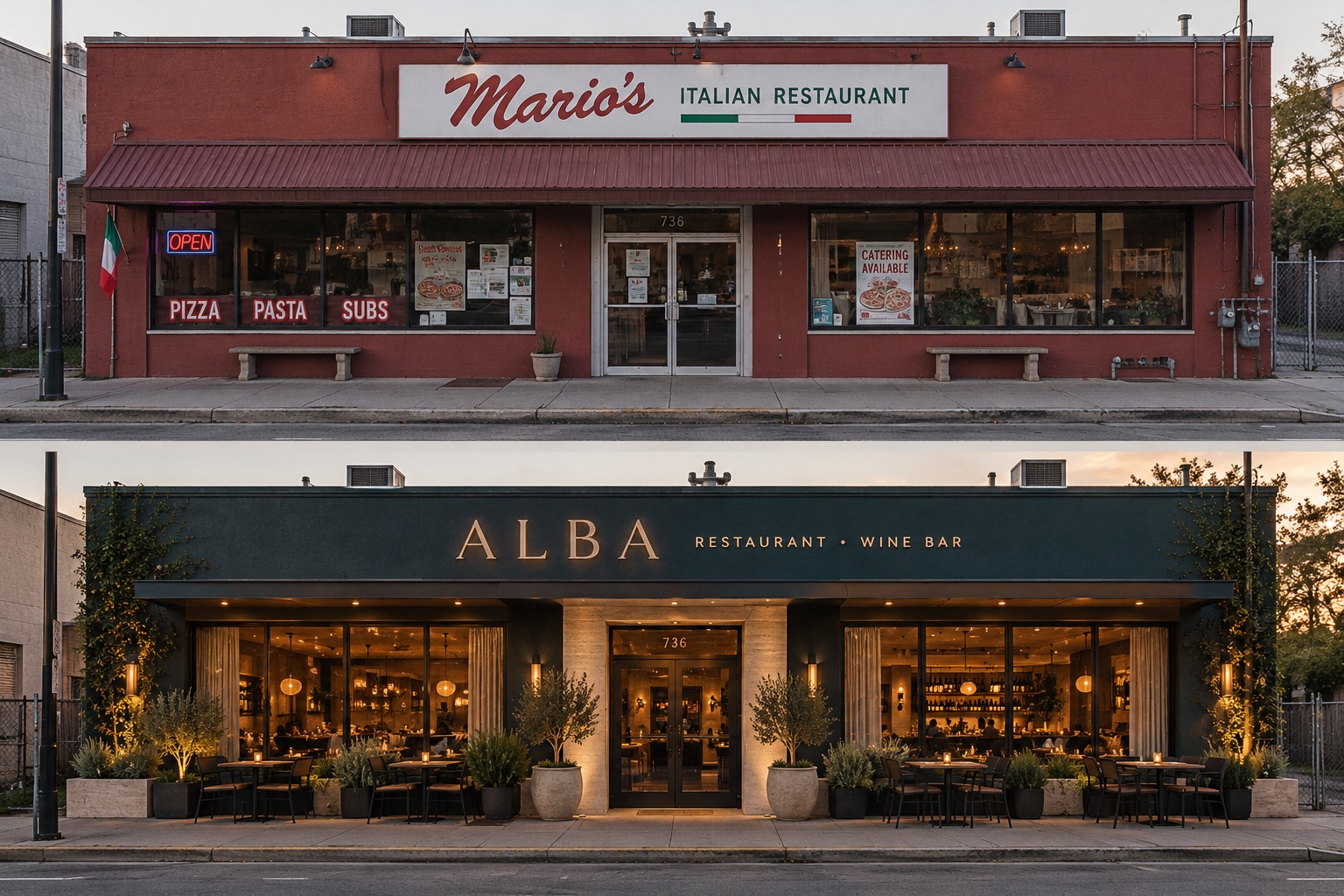
A familiar building with a different first impression
A restaurant’s exterior is the first part of its atmosphere that a guest experiences. Before anyone reads a menu, the frontage communicates something about the place: its character, its level of formality, and how welcoming the entrance feels. This concept explores how a modest one-story restaurant could develop a more refined identity without replacing its basic building form.
The comparison is a generated design study rather than documentation of a built renovation. Mario’s and Alba are illustrative identities within the image. There is no measured survey, construction specification, or claim of a real business transformation behind the proposal. The useful question is what the visual changes achieve and which ideas could translate to another storefront.
What makes the original frontage feel dated?
The red-brown walls, matching corrugated awning, large white sign, and window posters each demand attention. Together, they leave little hierarchy. The sign is prominent, but the entrance beneath it feels comparatively quiet. Long windows are a valuable feature, yet the graphics and heavy canopy reduce their visual connection to the street.
The building is functional and recognizable. Its simple horizontal form, centered doorway, and generous glazing already offer a good starting point. A redesign does not need to disguise that structure. It can give those existing features a clearer relationship.
A deep blue-green backdrop with controlled warmth
The proposed exterior uses a desaturated blue-green to unify the long frontage. Across a broad wall, the color reads as a calm architectural background rather than a collection of separate accents. It also creates a rich setting for the lighter entrance and warm lettering.
Travertine-toned material around the doorway supplies contrast and texture where it matters most. Bronze-toned frames, a darker canopy edge, and warm metal signage extend that palette. The balance depends on restraint: one strong body color, one lighter focal material, and a consistent metal family. The image does not specify exact paint products or confirm that the stone-like finish is natural stone.
Make the entrance the easiest element to find
The light surround gives the central doorway a stronger presence without moving it. The windows remain broad and open, while the proposed door and framing feel more connected to the overall scheme. Instead of spreading bright accents along the entire exterior, the design concentrates contrast around the arrival point.
The slim canopy also changes the building’s proportions visually. Its quieter profile leaves more room for the sign band to read as a deliberate horizontal element. On a real project, its dimensions, drainage, attachment, and relationship to existing equipment would need to be developed before construction.
Signage and lighting should belong to the architecture
The Alba lettering is spaced across the upper exterior, with a smaller restaurant and wine bar descriptor alongside it. The dark background allows the warm lettering to remain legible without a large white panel. This makes the signage part of the composition rather than an object placed over it.
Warm light beneath the canopy, beside the entrance, and within the restaurant gives the proposed frontage an inviting evening character. The comparison also shows different light conditions, so some of the atmosphere comes from the warmer hour and illuminated interior. A real material decision should also be reviewed in ordinary daylight. The exterior still needs to work when every light is switched off.
Planting softens the frontage without hiding it
Tall planters at the entrance, lower planting beside the windows, and restrained climbing greenery add depth to an otherwise flat elevation. Their placement follows the building’s rhythm. The doorway stays visible, and the planted edges provide a softer transition between the glazing and pavement.
The concept also introduces outdoor tables. For an actual restaurant, seating and planters should be planned around clear entry routes, door operation, pedestrian movement, and the space genuinely available. Furniture, planting, and lighting belong in the same exterior plan; they should not be added only after the exterior is finished.
What to take from this transformation
The change is more than a new paint color. The palette, canopy, entrance surround, lettering, metal finishes, lighting, and planting all reinforce one direction. That coordination is what gives a simple building a more intentional presence.
For your own restaurant, cafe, salon, or other commercial property, start with clear exterior photographs and identify what must remain. Then consider the brand, the entrance, the existing openings, and the realistic scope of improvements together. A visualization can help you assess that direction before committing to finishes, while the detailed construction and installation decisions follow separately.