8 Warm Modern House Exteriors with Playful Color Accents
Explore eight warm modern house exteriors with blush, sage, teal and clay accents, plus Benjamin Moore and Sherwin-Williams colors to sample.
A little color can change the whole exterior
An exterior can be calm without being colorless. A blush front door, a sage-green metal edge or a clay-toned wall can make a home feel individual while leaving the architecture in charge. The difference is usually not how bold the color is, but where it is placed and what surrounds it.
These eight homes explore different ways to combine expressive accents with timber, masonry, stucco and restrained roof colors. Some use paint as the main point of interest. Others let natural wood or brick do that work. Together, they show why the best accent is part of a complete exterior rather than an isolated decorative choice.
The Benjamin Moore and Sherwin-Williams colors below are suggestions to sample for a similar direction, not confirmed paint specifications or exact matches to the images. Lighting, texture and the surrounding finishes can change their appearance considerably.
1. A blush-pink door against warm ivory
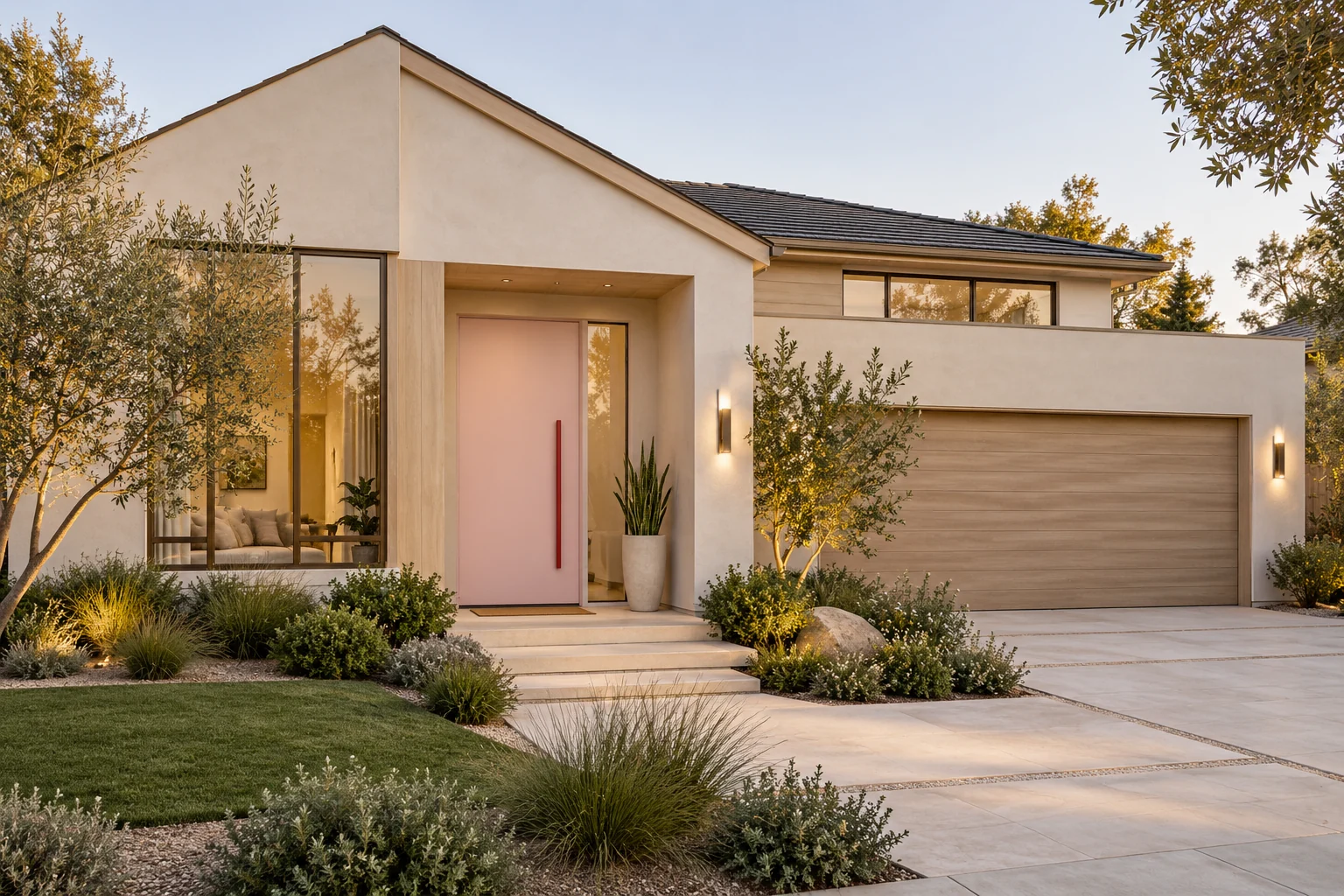
The first home keeps its main surfaces quiet: warm ivory walls, a muted garage finish and light timber around the glazing. The pink front door is the exception. Because it sits within a deep, clearly defined opening, it becomes an architectural focal point rather than a patch of color added to an otherwise unrelated wall.
The garage does not need to repeat the pink. Keeping that much larger surface subdued lets the smaller door feel special. Planting and natural wood give the pale palette enough texture that the pink reads as warm and welcoming.
For a light blush direction, sample Benjamin Moore First Light 2102-70. For a more earthy pink-brown, compare Sherwin-Williams Redend Point SW 9081. The latter will create a more grounded, less pastel effect. I would test both beside the actual wall finish and door hardware before choosing.
Benjamin Moore First Light 2102-70
2. Sage siding with a clay-colored garden screen
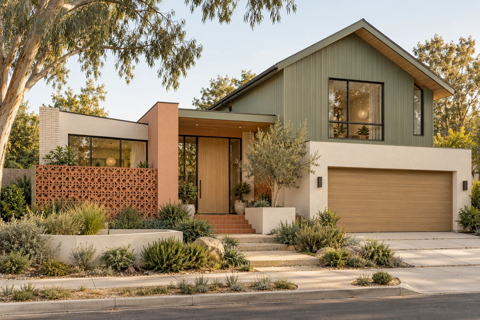
This California-inspired home uses color across more than one architectural element, but each has a different job. Sage-green siding defines the upper gable. White lower walls keep the house light. The clay-toned breeze-block screen adds a smaller, warmer note near the pedestrian approach.
The screen works particularly well because its openings create texture and shadow. It does not need a bright saturated finish to stand out. Natural wood at the entrance helps bridge the green and clay tones, while the garage remains visually quieter.
Sherwin-Williams Evergreen Fog SW 9130 is a useful starting point for a muted green direction. Cavern Clay SW 7701 could be sampled for a paintable screen, planter or smaller entry element. These are complementary ideas, not a requirement to paint both a large wall and a large screen strong colors.
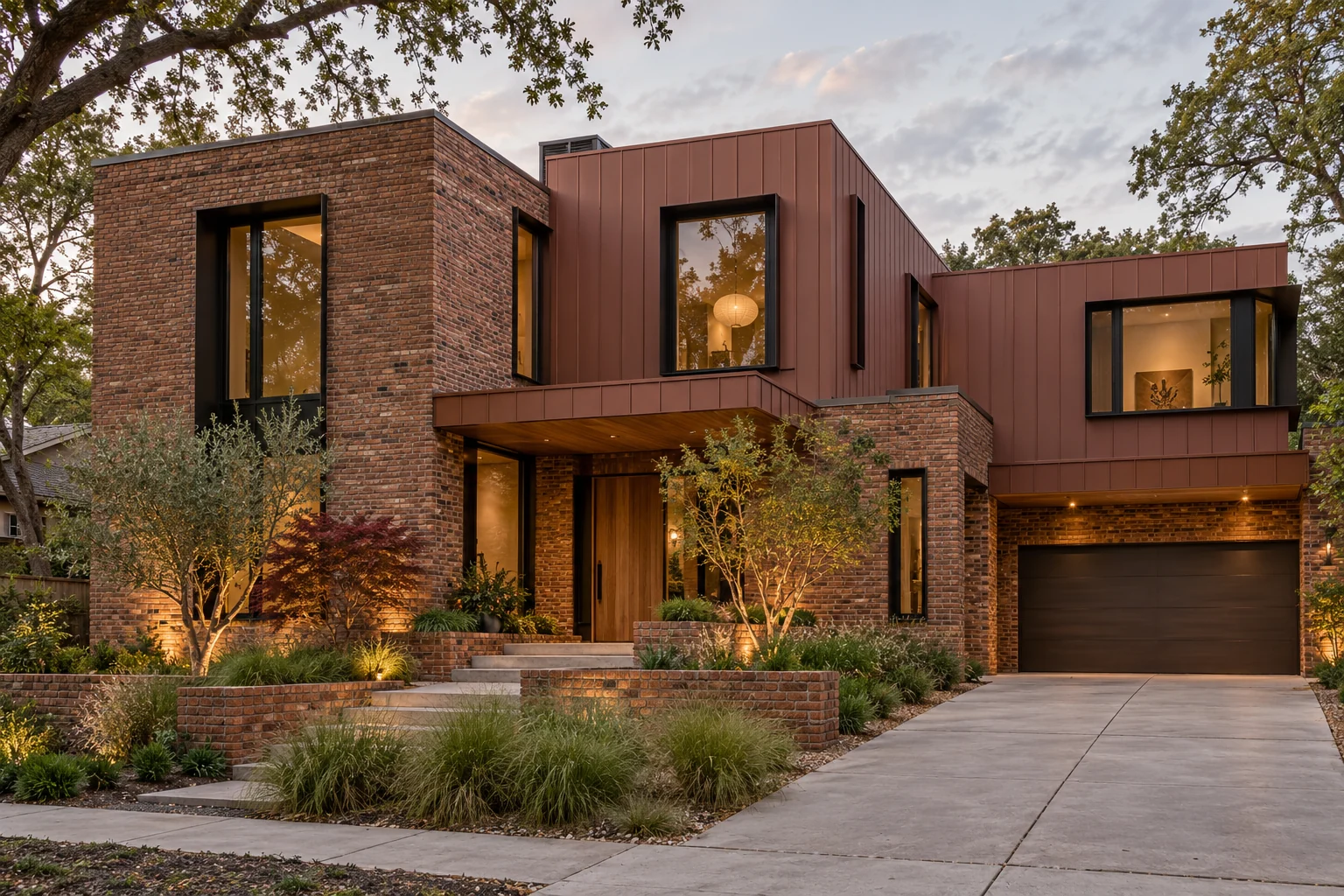
3. Red-brown brick with terracotta-colored metal
The flat-roofed brick home shows how a stronger color can belong to the building itself. The muted reddish metal finish relates to the brick below, so the upper level feels connected even though the materials are different. Dark windows and a dark garage create depth without introducing another vivid hue.
This is a tonal approach: several related warm colors rather than one exact match everywhere. Brick brings natural variation, metal brings a more continuous surface, and timber softens the entrance. The contrasts are largely about texture and scale.
For a painted accent inspired by this warm clay family, sample Sherwin-Williams Cavern Clay SW 7701 beside your masonry. A factory-finished metal panel will need its own physical finish sample; a paint name alone does not specify a metal-cladding product.
Read about brick and siding color combinations
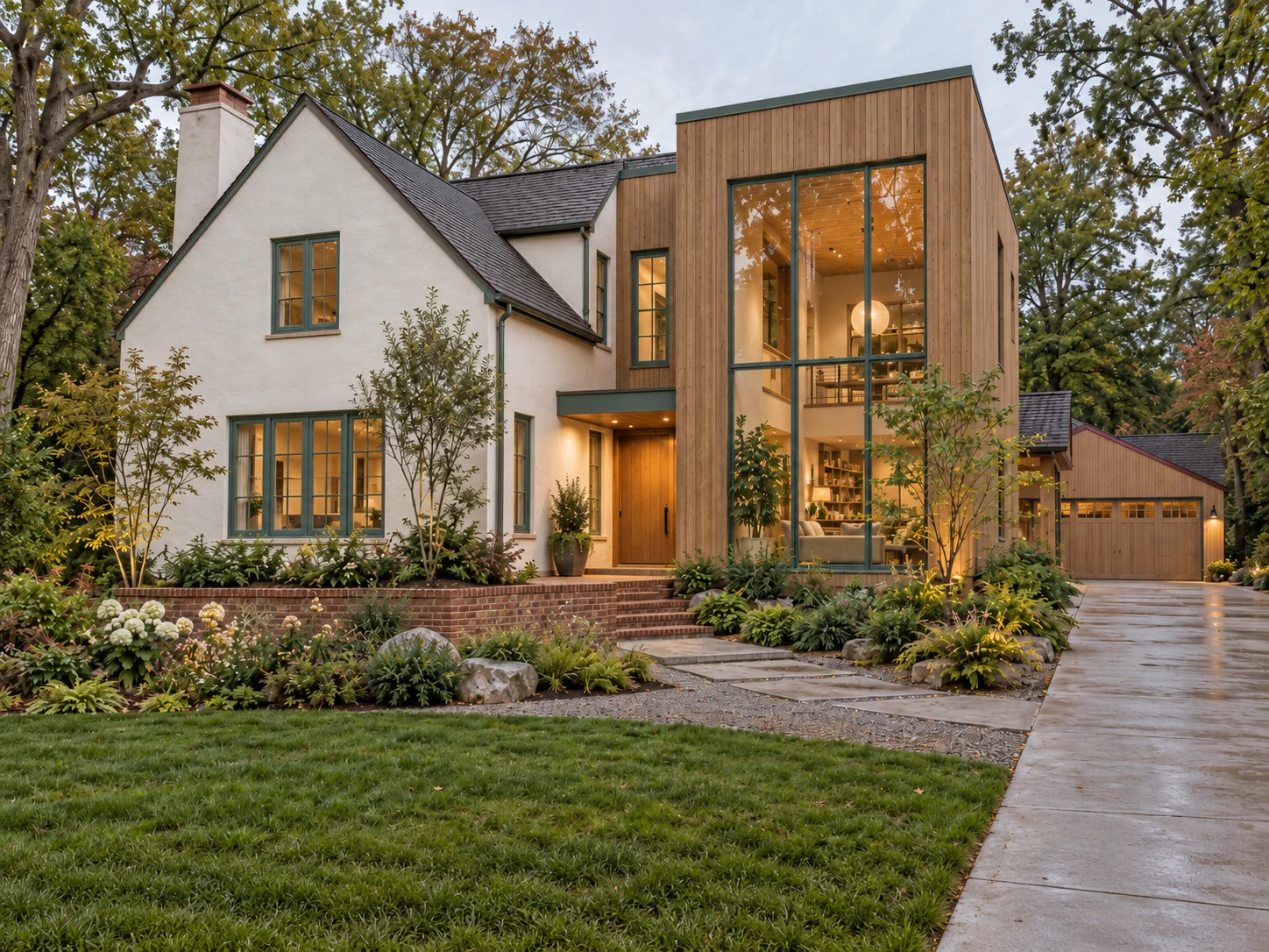
4. Timber, white stucco and green-teal window frames
The white gabled volume and tall timber volume have very different shapes. Repeating the green-teal window color across both helps them belong to the same house. The frame color becomes a quiet connecting thread, while the timber retains its own natural warmth.
This is a good example of using repetition instead of adding more materials. If each volume also had a different window finish, the composition would be much harder to read. A consistent frame tone lets the architecture stay varied without feeling disconnected.
Benjamin Moore Aegean Teal 2136-40 offers a blue-green direction worth exploring for a paintable door or trim accent. For manufactured windows, use the supplier’s available finishes and compare real samples. Do not assume a frame can be painted without checking the manufacturer’s instructions and warranty.
Benjamin Moore Aegean Teal 2136-40
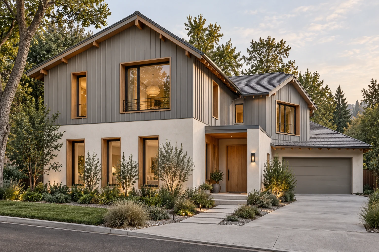
5. Cool gray siding warmed by timber
Not every playful exterior needs a colorful door. Here, gray vertical siding and white lower walls form a restrained backdrop, while wood around the windows makes the openings feel warmer and more substantial. The wood is concentrated around features rather than spread across every surface.
The dark roof belongs to the cooler side of the palette. Timber balances that coolness, and planting softens the transition to the ground. The result has character without relying on a bright painted accent.
If you wanted one additional note of color, I would start with a small front door or planter in a muted green or blue-green, then review it from the street. Adding contrast to every window, gutter and garage door would weaken the restraint that makes this example work.
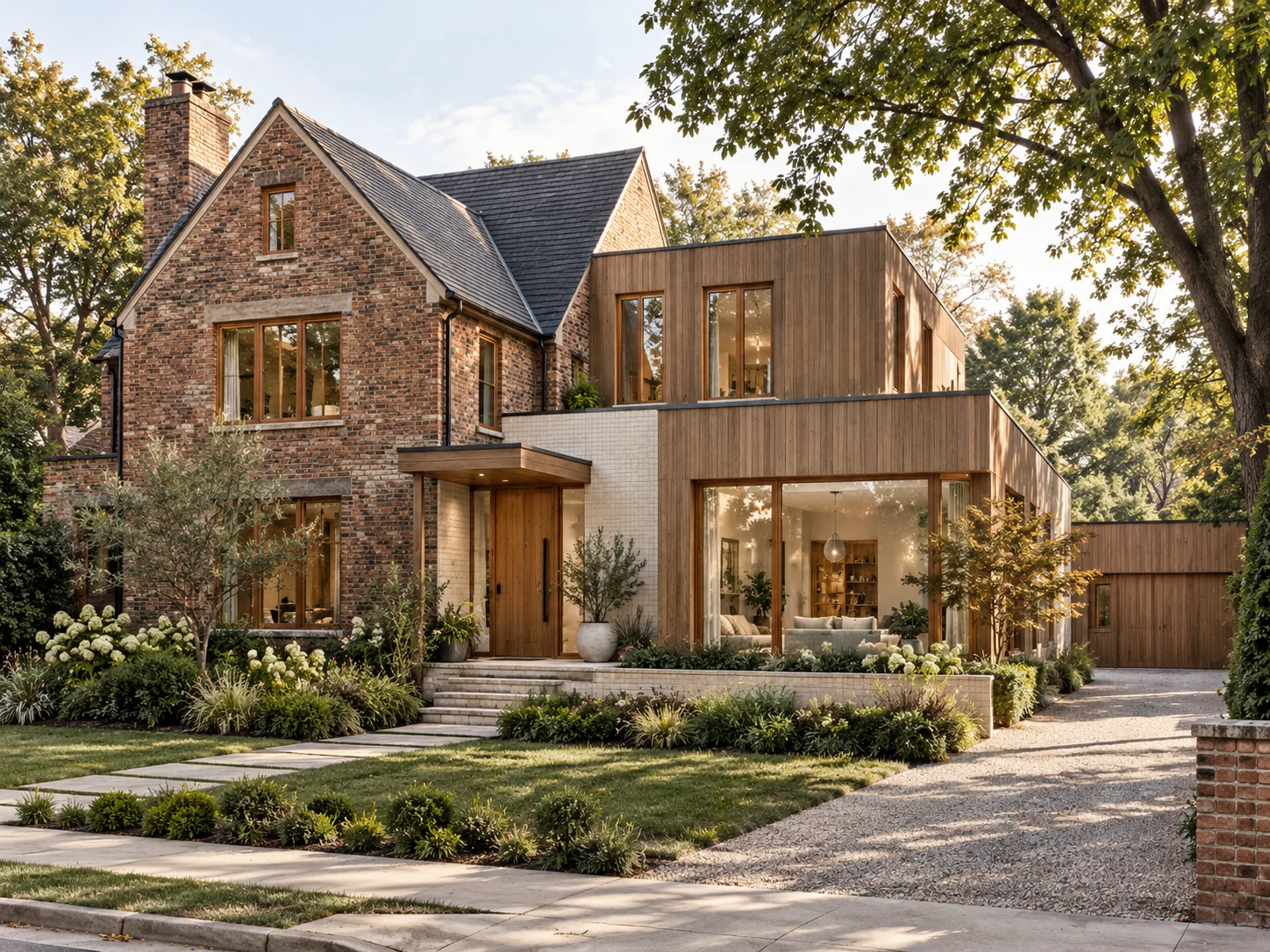
6. Aged brick with a contemporary timber addition
The older-looking brick gable and contemporary timber addition share warmth, but they do not try to look identical. The masonry provides texture and a sense of permanence; the vertical timber gives the newer volume a lighter visual rhythm. Pale lower finishes keep the ground level from becoming too heavy.
When a house already has richly varied brick, that masonry is part of the color palette. There is often no need to add several other statement finishes. A timber door, warm window surround and well-positioned lighting may provide all the interest the entrance needs.
A pink-brown such as Redend Point is an option to sample for a small painted element in this kind of palette, but the brick undertone must lead the choice. If the masonry is distinctly orange, purple or very dark, the same paint can read quite differently.
How to modernize red brick without painting it
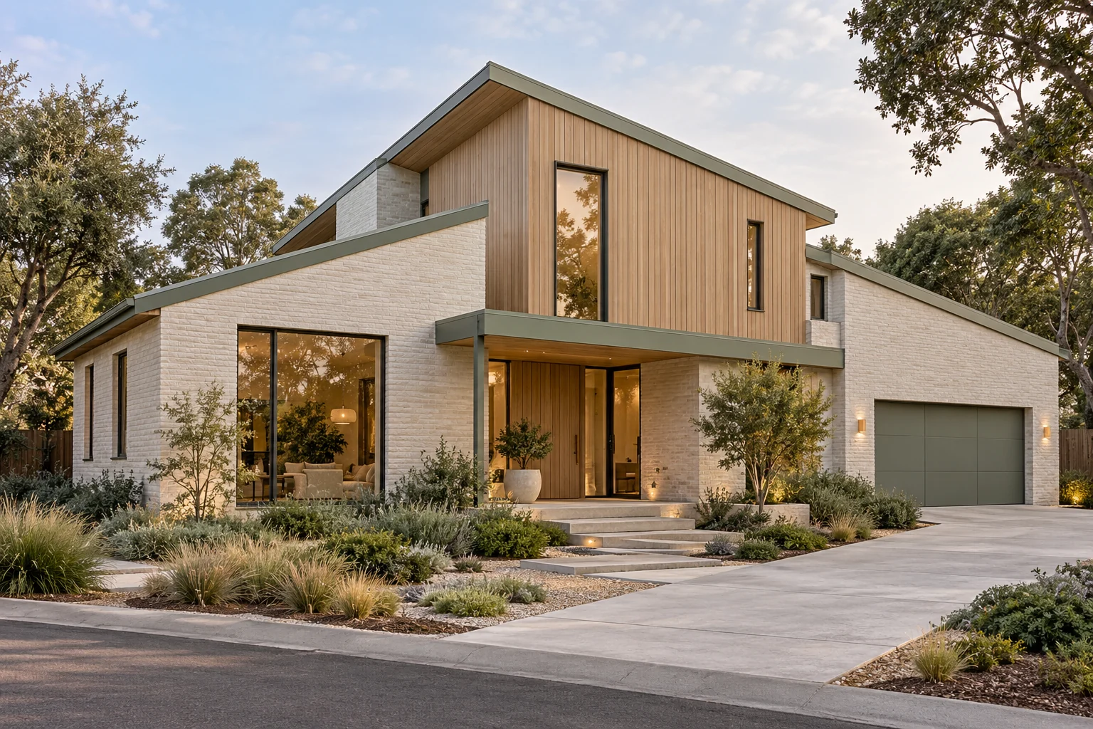
7. Pale masonry, timber and sage-green details
This angular contemporary house puts muted green into the metal edges, entrance beam and garage door. The color reinforces the building’s geometry instead of appearing only as decoration. Pale masonry gives the green room to breathe, and timber adds warmth to the upper volume.
The garage is a larger color field here, so it needs to relate to other visible details. Repeating the green along architectural lines makes that choice feel considered. The palette stays limited even though the house has several distinct volumes.
Evergreen Fog SW 9130 is a starting point for a softer green accent. Aegean Teal 2136-40 would take the idea in a bluer, more pronounced direction. Compare the samples with the timber finish first; yellow-orange wood and weathered gray wood will produce different combinations.
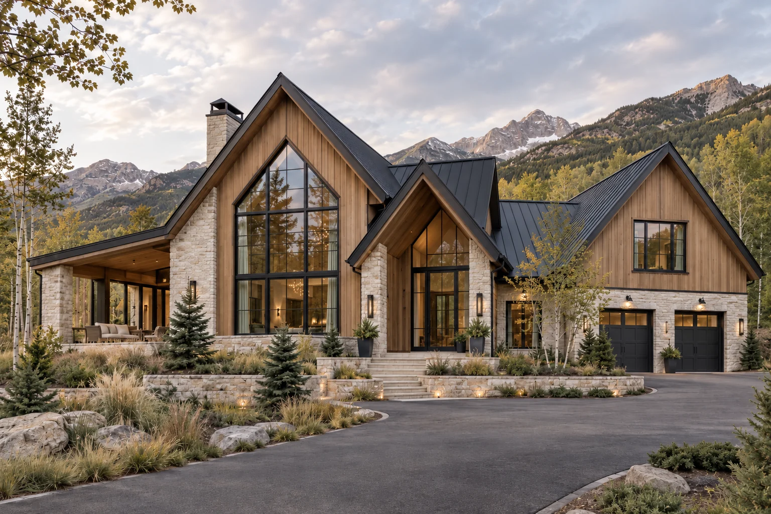
8. Mountain architecture with natural-material accents
The mountain house demonstrates the quieter end of the same principle. Steep gables, tall glazing and substantial stone already create a strong identity. Timber provides warmth, while the dark roof and window frames outline the architecture. Another large statement color could become unnecessary competition.
On a house like this, a playful accent might be limited to a door within a sheltered entrance or a small outdoor accessory. The stone, roof and timber should remain the reference points. A muted green can connect to the surrounding landscape; an earthy clay can echo warmer tones in the masonry.
The lesson is to choose the amount of color your architecture needs. Sometimes personality comes from a pink door. Sometimes it comes from a beautifully judged combination of natural materials.
Five accent colors worth sampling
Use these as a small shortlist, not a palette to apply all at once. Choose one color family for the main accent, then decide whether it should appear once or repeat in a few carefully selected places.
- Benjamin Moore First Light 2102-70: a light pink direction for a front door against quiet ivory or pale masonry.
- Sherwin-Williams Redend Point SW 9081: an earthy pink-brown direction for a more muted door or small entry detail.
- Sherwin-Williams Cavern Clay SW 7701: a warm clay direction for selected planters, a paintable screen or an entry accent.
- Sherwin-Williams Evergreen Fog SW 9130: a subdued green direction to explore with timber and pale masonry.
- Benjamin Moore Aegean Teal 2136-40: a stronger blue-green direction for a door or suitable painted trim.
How to keep a fun accent sophisticated
Begin with the elements that will remain: roof, brick, stone and window finishes. Choose an accent that makes those fixed elements feel intentional. Then decide what deserves attention. The front door is often a better focal point than the garage, but the architecture and approach to the house should guide that decision.
Keep the size of the color field in mind. A blush door surrounded by pale walls is very different from blush siding across an entire house. Likewise, a green metal edge is much quieter than a green garage door. View the combination at the scale you will actually use.
Test physical samples outside, next to the existing materials, in sun and shade. These images include warm evening light, which can make timber, masonry and pale paint look warmer. Confirm that your chosen coating is suitable for the surface, and check door, window and cladding manufacturer requirements before painting.
For renovations, work with the character your home already has. For a new build, coordinate paint with actual masonry, timber and manufactured-finish samples before ordering. A complete exterior design can help you see whether the accent supports the entrance, proportions and material placement before making those decisions.
Test exterior paint colors in real light