11 Exterior Color and Material Combinations for a Warmer Home
Explore 11 exterior color and material combinations, from olive stucco and warm brick to pale stone and timber, with practical guidance for your home.
An exterior palette is more than a wall color. Brick, stone, roofing, windows, doors and planting all influence how that color feels. A gentle peach can look architectural beside charcoal timber; a deep brown can feel welcoming when a pale stone entrance gives it balance.
These eleven architectural palette studies explore warm modern, European cottage, contemporary and Mediterranean-inspired directions. They are useful visual references for both renovations and new builds, rather than records of completed construction. The color names below describe what appears in the images; they are not verified paint matches or product specifications.
The common thread is restraint. Each exterior gives one material the leading role, uses a second to support the architecture and concentrates contrast where it matters most. Here is what makes each combination work and how to use the same thinking on your own home.
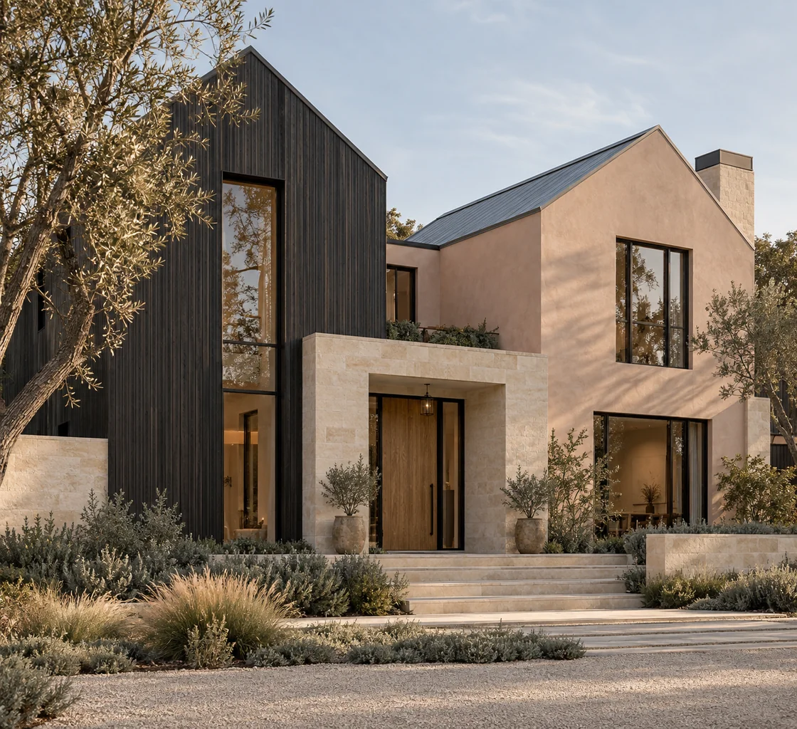
1. Soft Peach, Charcoal Timber and Pale Stone
The warm modern home at the top of this article combines peach-toned plaster with dark vertical cladding and pale stone. The peach is muted rather than bright, giving the walls warmth without turning the entire exterior into a statement color.
The darker gable creates a clear vertical element, while the lighter entrance surround brings attention back to the door. Tall windows continue that upward rhythm. The stone steps and planting carry the warmer tones toward the ground, so the entrance feels connected to its surroundings.
This direction can suit a modern gabled new build or a carefully updated existing home. Keep the peach in the background and test it against the actual roof and masonry. A strong orange undertone could change the balance substantially.
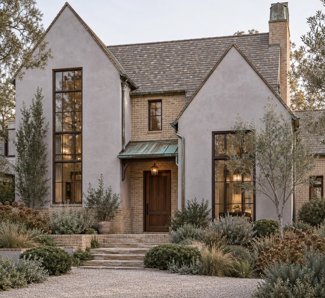
2. Soft Gray Plaster and Aged Warm Brick
The European cottage-inspired exterior shows how a quiet gray can sit comfortably beside warm masonry. The plaster reads as a soft gray with a faint lavender cast, while the brick introduces uneven earthy color and texture.
Because the steep roof, tall windows and gables already provide character, the walls do not need heavy trim or several accent colors. A timber door gives the entrance a warmer center, and the small metal canopy adds a different texture without competing with the roof.
For a house with existing brick, this is a useful principle: choose a wall color that supports the variation in the masonry rather than trying to match every brick. View a large sample beside the brick and roof, including in shade.
Explore brick and siding color combinations
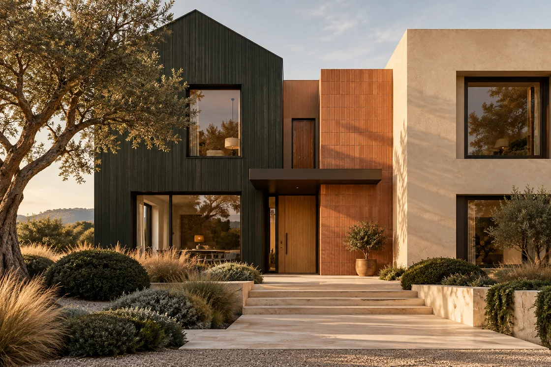
3. Dark Timber, Clay Color and Sandy Stucco
This modern Mediterranean-inspired entrance uses three distinct wall treatments: very dark vertical cladding, a clay-colored central plane and sandy stucco. Their placement matters as much as their color. Each finish belongs to a clear building volume rather than appearing in scattered decorative patches.
The clay tone leads toward the entrance, while the pale steps create a gentle approach. The dark cladding gives the composition depth and makes the lighter surfaces feel more luminous. Rounded shrubs and grasses soften the angular walls.
When using a similar palette, decide which volume should be darkest and which should identify the entrance. Avoid outlining every window with another contrasting finish; the material arrangement already provides plenty of definition.
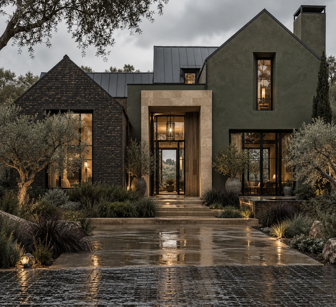
4. Moss Green, Dark Brick and a Light Entrance
The rustic gabled example has a much deeper palette. Moss-green plaster and dark brick sit close in value, allowing their textures to do more of the work. Pale stone around the entrance becomes the focal point instead of bright trim around every opening.
The roof shapes combine traditional gables with simpler metal-roofed areas, giving the house a modern rustic character. The planting echoes the subdued greens and keeps the dark walls from feeling isolated against the site.
This approach works best when the entrance remains easy to read. If your home has small windows or a heavily shaded entry, consider whether a slightly lighter main wall color would retain the mood while making the proportions clearer.
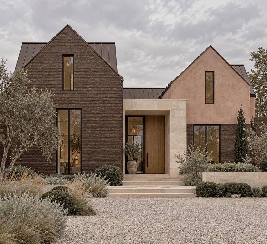
5. Dusty Rose Plaster and Brown Brick
Dusty rose is an unusual exterior choice, but the image shows why it can feel restrained. Its low saturation relates to the brown brick rather than creating a sharp contrast. The two gables remain distinct while still belonging to the same warm family.
A pale stone entry surround provides a quieter third material. The slim dark window frames add definition without introducing thick outlines, and the natural wood door keeps the entrance welcoming.
For your own home, a pink-beige or rose-taupe finish needs careful sampling. Next to strongly orange brick, the same color could look very different. Use this image as a guide to softness and balance, then select the exact shade from the materials at your property.
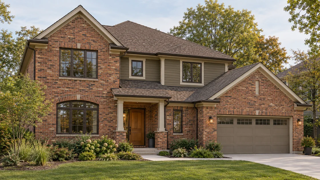
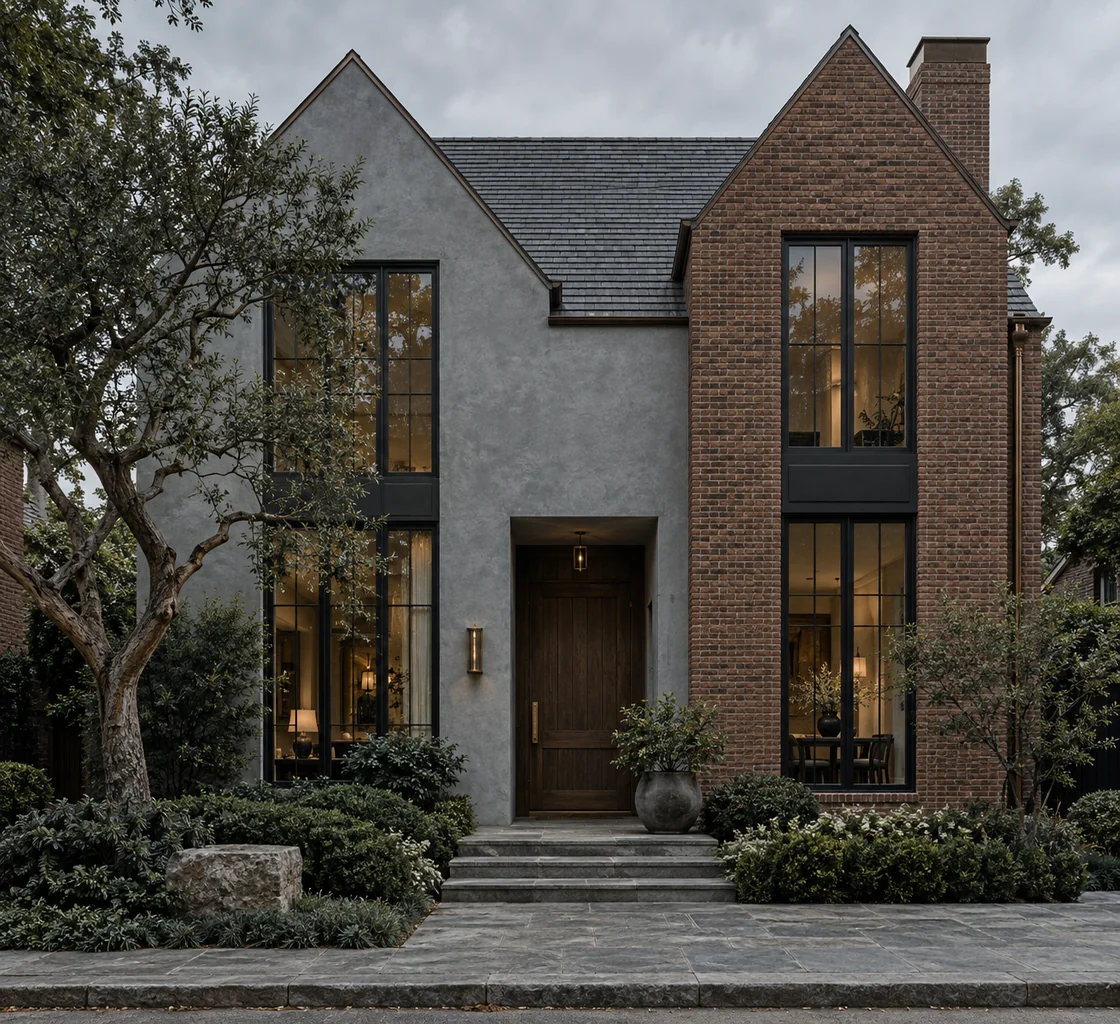
6. Blue-Gray Plaster and Red-Brown Brick
The modern traditional home pairs cooler blue-gray walls with warmer red-brown brick. That temperature difference gives the exterior interest, while the similarly subdued colors prevent either material from becoming overpowering.
The brick occupies a strong gabled volume, and the plaster carries the adjacent walls. A dark wood door and slim metal details bridge the two. The gray roof supports the cooler wall color, while planting supplies a softer edge at ground level.
If you are retaining red brick, you do not have to choose only cream or beige for the surrounding walls. A muted blue-gray may be worth exploring, provided it works with the roof, mortar and brick variation as a whole.
Read the guide to exterior colors for red brick
7. Sage-Gray Brick, Sand Stucco and Terracotta
This Mediterranean-inspired home uses muted sage-gray masonry beside sandy stucco and clay roof tiles. The green-gray is subtle enough to feel like a material tone, while the roof adds a warmer note above it.
The composition combines a gabled masonry volume with lower stucco areas. A substantial but simple entrance surround gives the doorway presence, and the wide steps reinforce the sense of arrival. The planting repeats gray-green and earthy tones.
The lesson is to work with the roof rather than ignoring it. A visibly warm tiled roof influences every wall selection below. Pale stone, gentle greens and muted sandy colors offer a more layered direction than bright white walls alone.
See more Mediterranean exterior renovation ideas
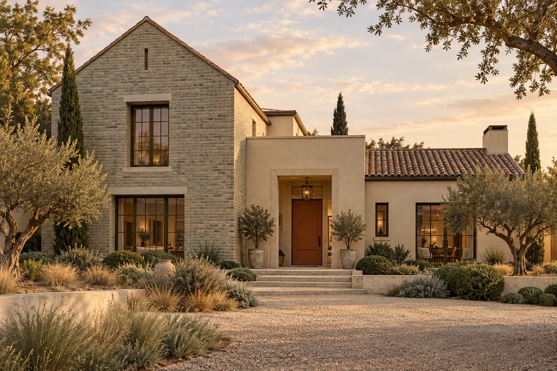
8. Aubergine-Brown Walls and Pale Stone
A deep brown with a plum cast gives this contemporary gabled exterior an alternative to black. The broad wall planes stay simple, while pale stone around the entrance introduces light and texture.
The metal roof reads as a quieter gray, allowing the darker walls to lead. The timber door is visible within the recessed entry, and the pale walkway carries that focal point into the garden.
On an existing home, a related deep tone might work on siding, stucco or selected accents, but it should suit the material and exposure. The design principle is a limited palette with a deliberate light area, rather than dark finishes spread indiscriminately across every detail.
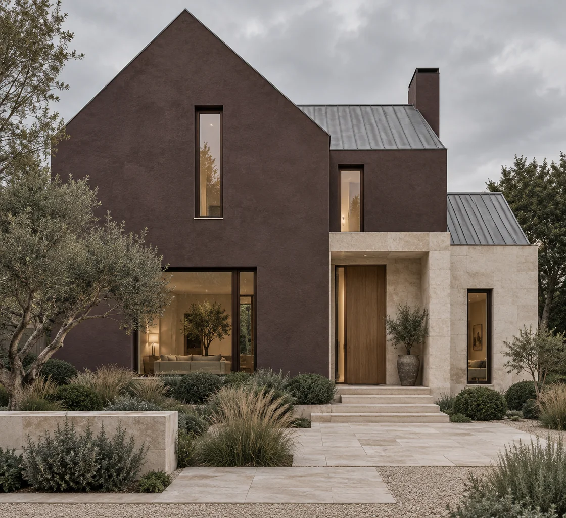
9. Butter-Cream Plaster and Earthy Brick
The storybook European example takes a lighter approach. Buttery cream plaster, brown masonry and gray roofing create a gentle palette with enough variation to reveal the steep roof and tall windows.
The walls have warmth without appearing bright yellow. Dark frames provide definition, while flowering borders, clipped shrubs and a clear stone approach make the entrance feel settled into the garden.
This is a useful direction for cottage and traditional homes with expressive roof shapes. Let the architecture supply the character; use softer wall colors and a modest number of materials to avoid competing with it.
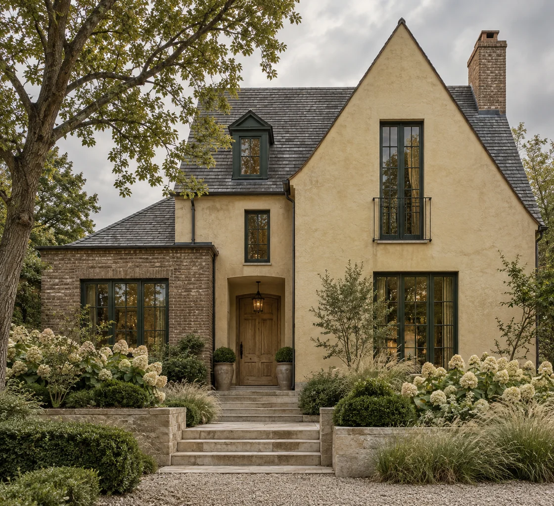
10. Olive Stucco, Pale Stone and Natural Wood
The Tuscan-inspired home demonstrates a tonal green palette with warm supporting materials. Olive walls relate to the surrounding trees, while pale stone and a timber door make the entry easier to distinguish.
Terracotta tiles continue the warmth at roof level. The planting is loose and textural, but the wide steps establish a clear route to the door. The result feels relaxed without losing architectural order.
Olive shades can vary from yellow-green to gray-green, so the exact choice should follow the roof and stone. For homes in the United States and Canada, treat the planting as inspiration for shape and texture, then choose species suited to the local climate.
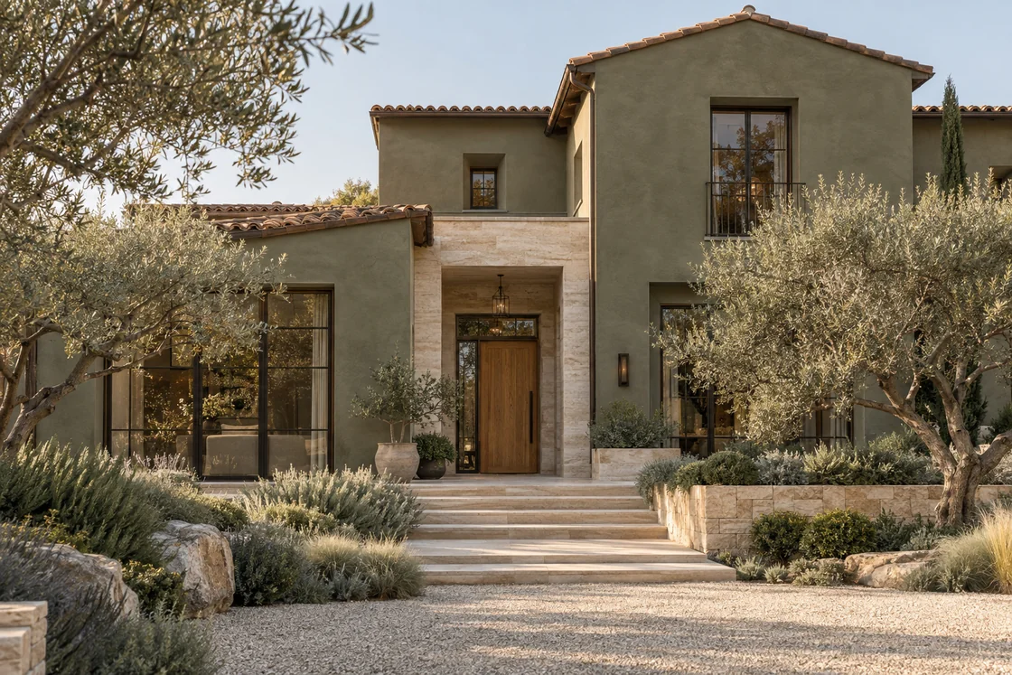
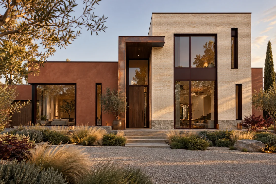
11. Burnt Clay, Cream Brick and Dark Red-Brown Frames
The contemporary final example combines burnt-clay wall color with a tall cream-brick volume. The contrast separates the building forms clearly, while dark red-brown window frames repeat the warmth of the clay.
The largest glazed opening belongs to the lighter volume, making its proportions a central feature. Lower planting and ornamental grasses give the geometric walls a softer foreground without hiding the entrance.
For a new build, this illustrates why material placement should be settled alongside elevations and window proportions. For a renovation, the same idea can be applied more selectively: give the principal wall material room to breathe and use a contrasting finish only where the existing architecture supports it.
How to Adapt an Exterior Palette to Your Own Home
Begin with what will remain. Your roof, brick, stone and existing windows establish boundaries for the new palette. Choose the broad wall finish next, then the entrance, trim and smaller metal details. Selecting each item independently makes it harder to see the overall result.
Use changes in material to explain the architecture. A stone entrance, timber-lined recess or different gable finish should correspond to a clear feature. Random strips of stone or cladding can make a simple house feel busier rather than more considered.
Check color and texture together. A smooth plaster wall reflects light differently from rough masonry, and timber introduces its own variation. Samples need to be viewed outdoors beside the existing finishes; the warm evening light in several of these images should not be mistaken for an exact daytime paint result.
- Identify the roof and permanent materials that will stay.
- Choose one leading wall material and a restrained supporting palette.
- Give the entrance a clear focal point through placement, contrast or texture.
- Review windows, doors, lighting and paving as part of the same composition.
- Confirm exterior suitability, measurements and installation requirements locally before ordering.
Can These Combinations Work on a Smaller House?
Yes, but simplify them. A modest ranch, split-level or two-story home may only need a main wall finish, retained masonry and a distinctive door. The value of these examples is the relationship between materials, not the size of the house or the number of finishes.
For a renovation, use a visualization of your actual home to review the balance before making major selections. For a new build, drawings or model views can establish how materials, windows and roof forms will read together. In both cases, the aim is an exterior that suits the property rather than a copy of an inspiration image.