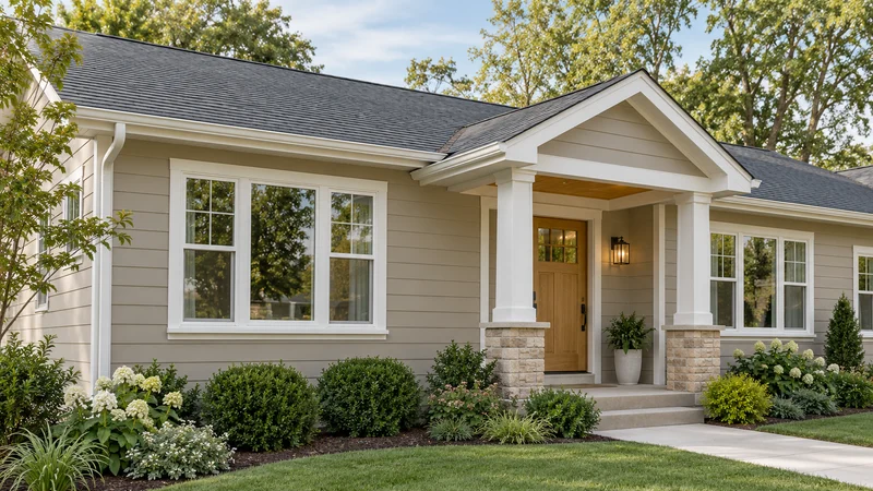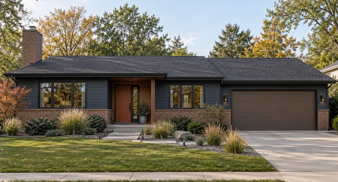
What Color Should I Paint My House? A Designer’s Guide
A practical sequence for choosing an exterior palette around your architecture, roof, brick, stone, and natural light.
1. Start with what is staying
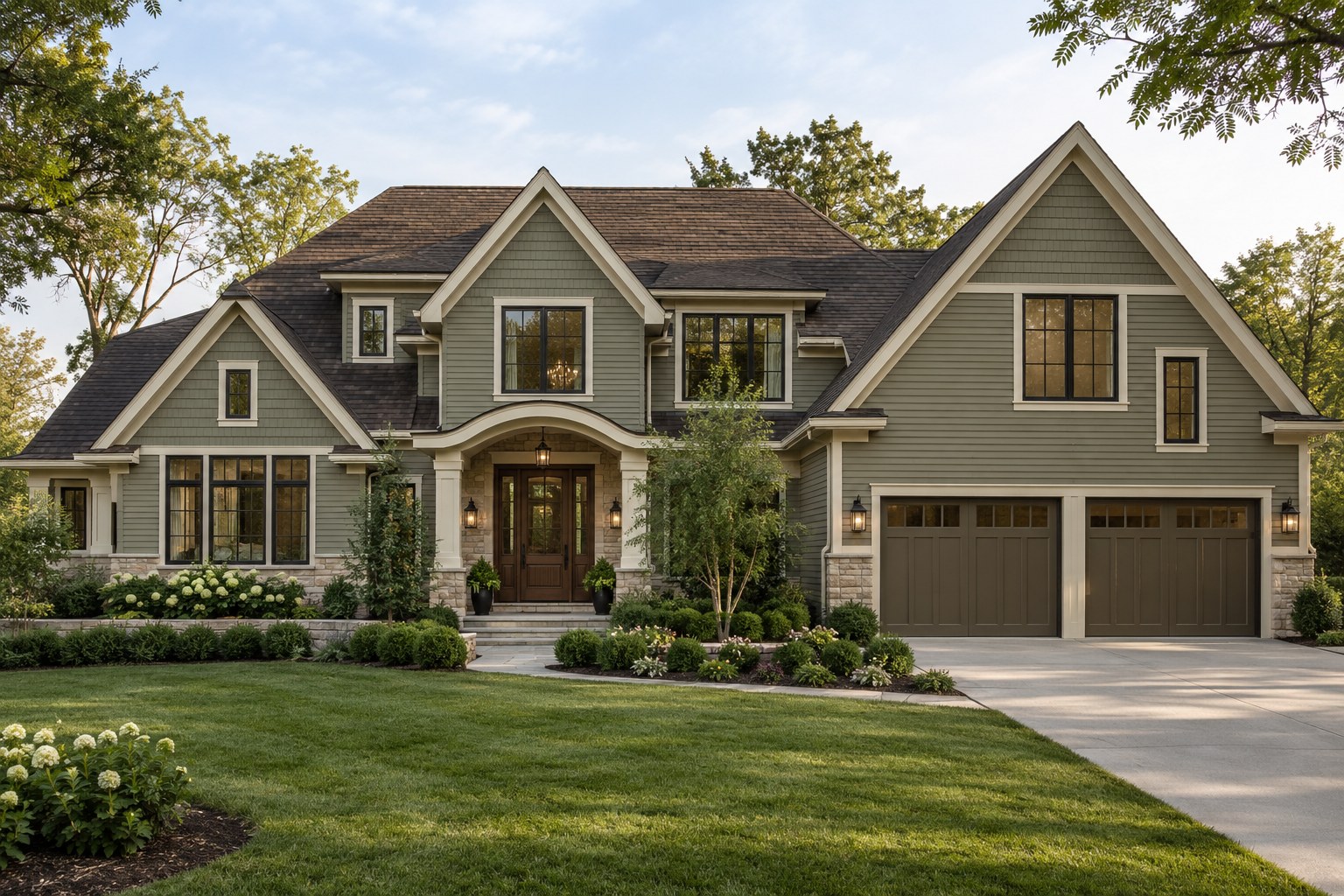
List the roof, brick, stone, windows, driveway, and other finishes you will retain. Photograph the entire exterior and the material junctions. These permanent surfaces define the range of colors that can feel convincing on your house.
Inspiration photographs are useful for identifying a mood, but their palette may depend on a different roof or window color. Translate the relationship you like rather than copying the paint in isolation.
2. Identify warm and cool undertones
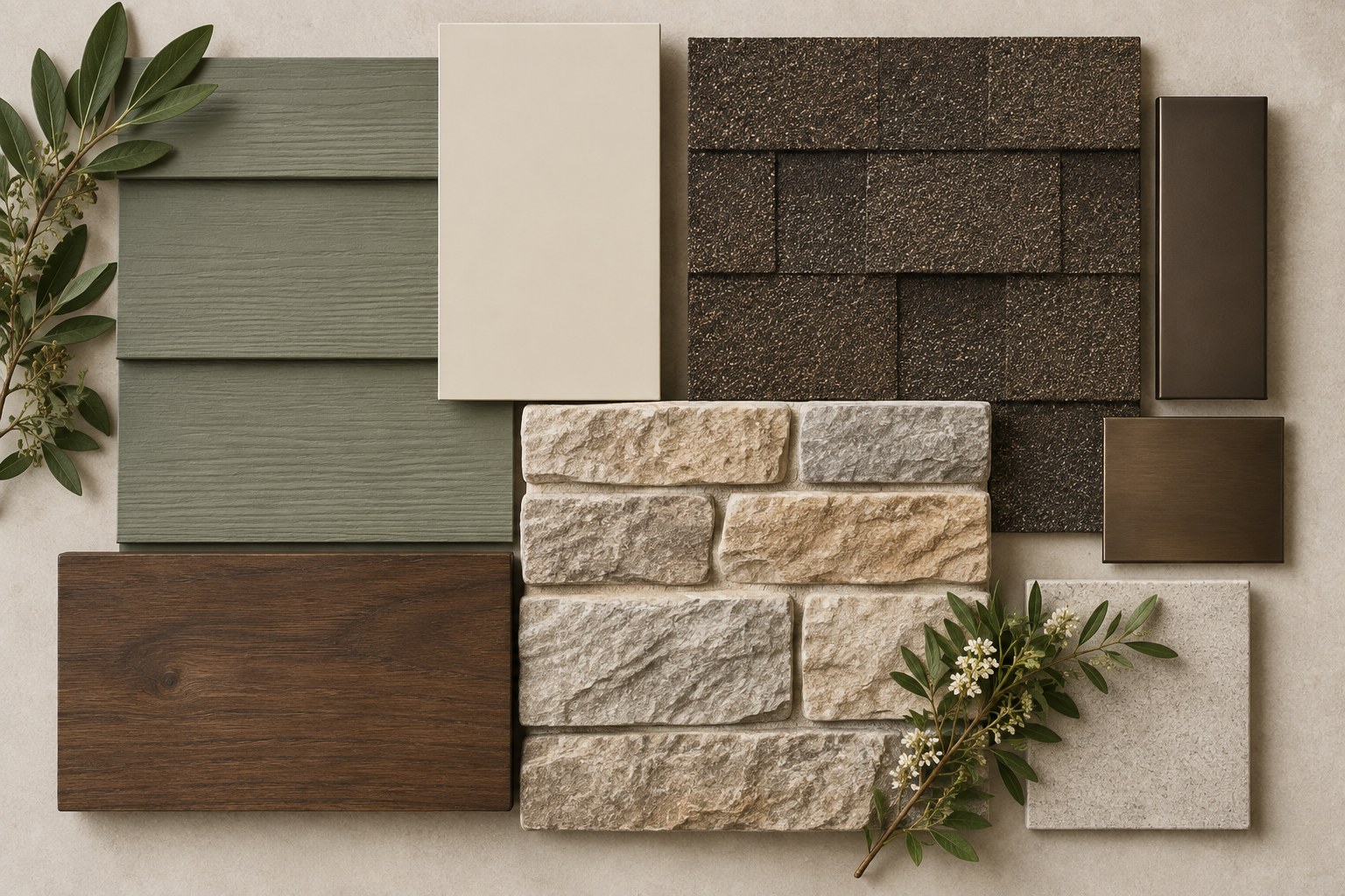
A neutral can lean yellow, red, green, blue, or violet even when its name sounds uncomplicated. Place candidate samples beside the fixed materials. Comparison makes subtle undertones easier to see than looking at a single chip.
Warm and cool elements can coexist. The question is whether the contrast feels controlled. A warm stone base may need a wall color that bridges it to cooler windows, rather than matching either material perfectly.
3. Respect the architecture
Traditional houses often benefit from clear relationships between walls, trim, shutters, and the entrance. Contemporary houses may need fewer colors and quieter transitions. Mediterranean plaster, a ranch’s horizontal lines, and Craftsman detailing each suggest different placement.
Do not use extra accent colors to compensate for unresolved proportions. Decide which architectural elements deserve emphasis before deciding how many colors to use.
4. Choose the main wall color
The main color covers the largest painted area, so assess it at the scale of the house. A pale tone may strengthen a heavy roof; a deeper one may give a broad exterior more definition. Neither direction is automatically correct.
Compare two or three coherent directions rather than twenty disconnected swatches. Keep notes on why each works with the existing materials. This makes the final choice more understandable and easier to communicate to a painter.
5. Choose trim and 6. decide what the garage should do
Trim controls contrast around openings. Work with existing window finishes and inspect porch shade, where an off-white can read differently. Decide whether gutters and soffits belong with the trim, wall, or roof.
A garage door close to the main wall color usually draws less attention. Contrast can be appropriate when the garage has attractive detailing or the architecture needs stronger balance, but it should not accidentally overpower the entry.
7. Give the front door a clear role
The entrance can become memorable through wood, a mineral color, a deeper neutral, or a restrained accent. Consider its size, setback, surround, and lighting. A dark door recessed in shade may need lighter surrounding surfaces to remain legible.
Check stain samples as carefully as paint. Wood grain, species, and finish change how the color reads; a small digital brown square is not a reliable prediction of a finished door.
8. Check natural light and 9. test large samples
View the palette on several elevations and at different times. Sun, shade, vegetation, and adjacent houses influence perception. Phone photographs and screens may shift colors, so use them to compare placement rather than certify an exact shade.
Apply large samples or use movable sample boards near the relevant materials. Confirm the product, finish, and substrate with your painter before purchasing the full quantity. Let samples dry before making the decision.
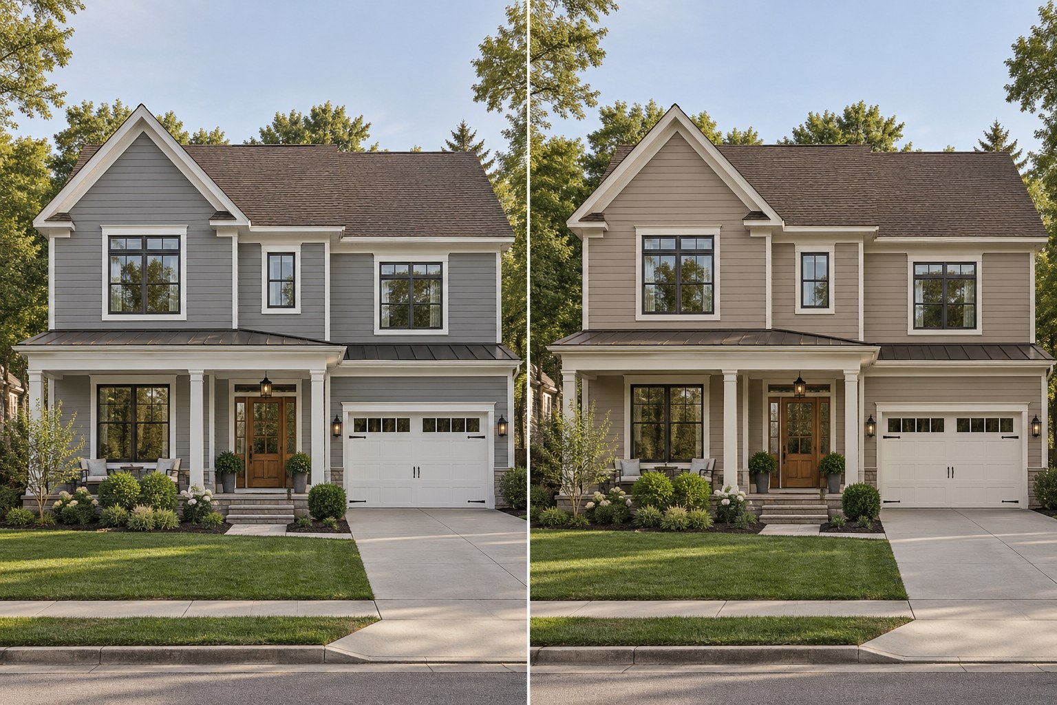
10. Judge the entire composition
A beautiful paint color by itself does not automatically create a beautiful exterior. The relationships between roof, walls, trim, door, garage, and landscape matter more than any single swatch.
Look from the street and ask where your eye goes first. Does that support the architecture? If one element dominates unintentionally, adjust its contrast or placement before adding another accent. A complete palette should make the whole house easier to understand.
Before buying paint, make a short finish schedule: list each surface, whether it will stay or change, its proposed finish and the physical sample you still need to test. This makes it easier to see whether several accent colors are competing for the same architectural role.
If you want a coordinated starting point rather than individual colors, compare the downloadable exterior paint palettes and assess each direction against your existing roof and masonry.
Before committing, test exterior paint colors in real light beside the surfaces that will remain.