Mid-Century Ranch Entrance Ideas: Breeze Block, Timber and a Quieter Garage
Compare three ranch entrance transformations using patterned screens, warm timber and quieter garages to give a long, low home a clear point of arrival.
Solve the entrance before choosing a new house style
A long, low ranch can have a front door that is technically central but barely visible from the street. The garage is larger, the windows form a repeated band and the roof stays close to the walls. Adding another color alone may not change that hierarchy.
These three visual studies explore a more specific solution than a general ranch makeover: giving the arrival depth through screens, timber and a quieter garage. The houses differ in masonry, roof and climate cues, but each uses the entrance as the organizing decision. The comparisons are illustrative exterior designs, not documented construction projects. Their actual dates, locations and budgets are not established.
A patterned screen creates a threshold
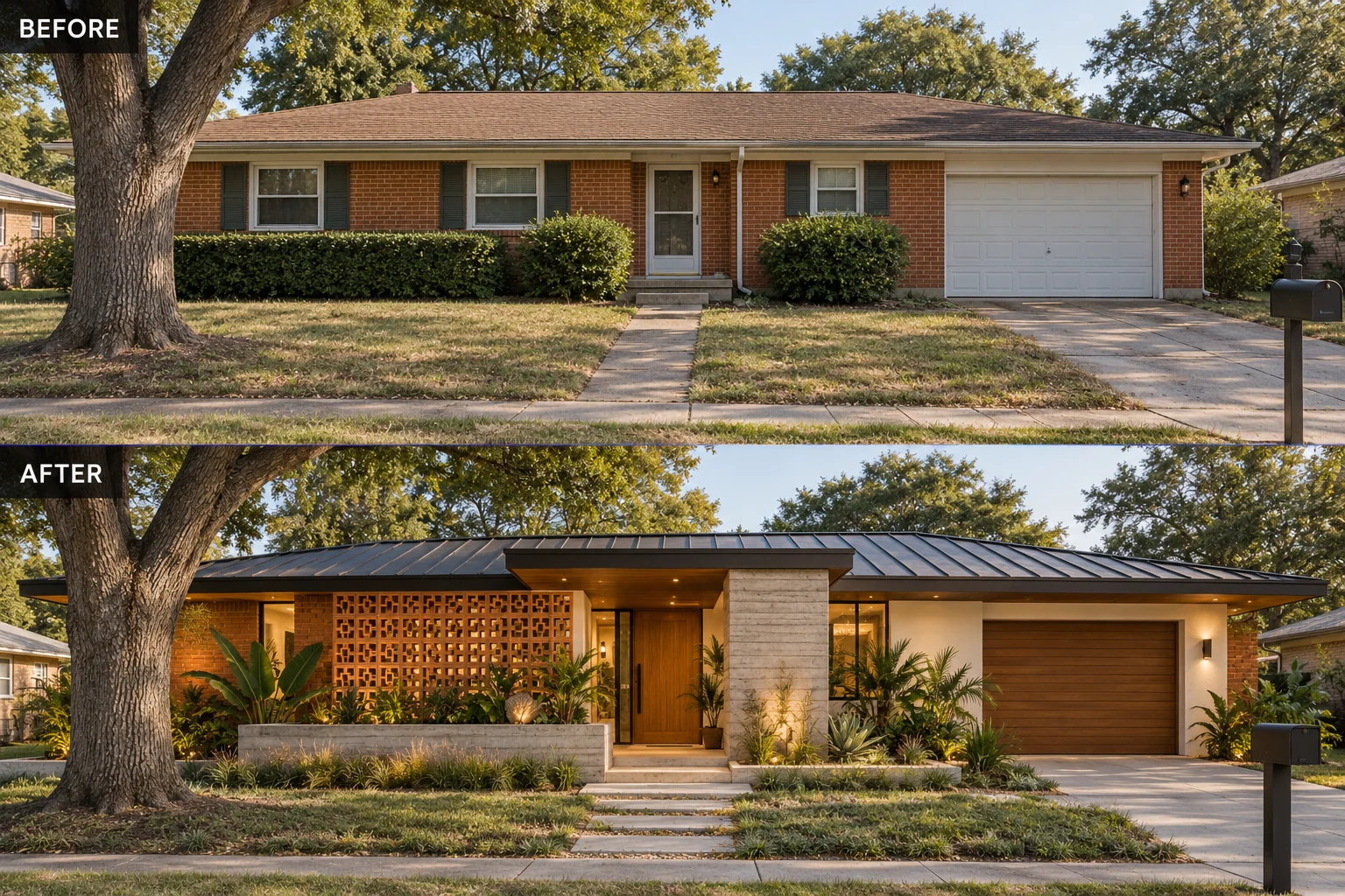
In the first ranch, the proposed entry is set behind a warm-toned patterned screen. It breaks up the otherwise broad wall and gives the doorway a sheltered-looking setting. The pattern is visible, yet occupies only part of the exterior, so it does not compete with every window.
The screen also changes how the approach is experienced visually. Instead of seeing a small door cut directly into a flat wall, a visitor reads a short sequence: path, planted edge, screened area and entrance. That sense of depth is valuable on a house with little variation in height.
A breeze-block or similar openwork wall should be selected for the actual application. These blocks are not interchangeable with a structural wall, and their support and installation need an appropriate design. The visualization shows the effect of a screen; it does not establish its construction.
Keep the garage in the background
The white garage in the original first view is a broad, bright rectangle. In the redesign, it becomes a muted brown surface that relates to the warm entrance. The door remains visible, but it is no longer the strongest contrast on the house.
This is especially useful when the garage faces the street. A dark garage is not always the answer, though. Its finish should sit within the whole palette rather than becoming an isolated black panel. Compare the garage against the main wall, roof and door before deciding how much contrast it needs.
A simple door profile can support a ranch’s horizontal character. Heavy decorative hardware or an elaborate carriage-house pattern would introduce a different visual language. Choose a style as well as a color.
A tropical version uses a lighter screen
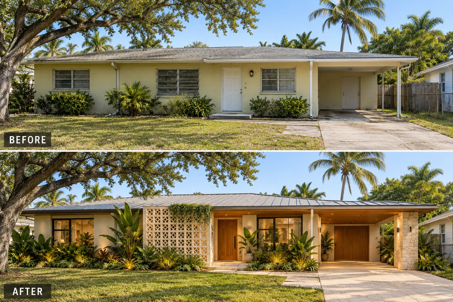
The second home begins with pale walls and a shaded carport-like opening. The redesign keeps the low horizontal silhouette but introduces a cream openwork screen near the entrance. Warm wood around the door and sheltered area gives the light walls a richer focal point.
The palms and broad-leaf planting in this study support a warm-climate character. The lesson is not to transplant those exact species to another region. It is to relate the screening, shadow and planting to the house’s setting. A cold-climate ranch could use the same visual hierarchy with different planting and an appropriate exterior material.
The screen is lighter here than in the first example. That choice allows the wood entrance to remain the warmer element. Two similar devices can therefore produce different atmospheres without needing completely different architectural forms.
A third ranch relies on a timber recess
The third comparison uses a darker wall palette and a warm timber-lined entrance rather than making the patterned screen the main feature. The door area is recessed, with glazing and selected wood surfaces providing depth. The garage finish sits within the darker family of surfaces.
This option may appeal to a homeowner who wants a strong mid-century direction but prefers fewer patterned elements. The entrance is made clear through material contrast and the path, while the long roof line stays prominent.
The proposed windows appear more open and less divided than the original. That is a construction decision, not a color treatment. If the existing windows must remain, test the same entry emphasis with their actual dimensions and frame color. The objective is a more readable entrance, rather than copying every feature in the image.
Let the low roof remain low
None of these entrance strategies depends on a large new front gable. A tall porch can be appropriate for some ranches, but it also changes their character. Screens and recesses offer another way to create emphasis through depth rather than height.
Material direction can reinforce that choice. Long wall surfaces and the roof preserve the horizontal reading, while a vertical wood area or patterned screen marks the entry. This smaller change in rhythm is enough to make the entrance noticeable.
Before deciding on an addition, compare an elevation with an entry screen, one with selective timber and one with a larger porch. A visualization can help you judge whether extra height improves the house or overwhelms the low proportions.
Choose the palette as a group
The first example pairs pale textured walls with a warmer screen and garage. The tropical version uses cream, timber and lush green planting. The third is darker, with wood acting as the warm point of contrast. Those are different palettes, not three versions of one universal paint recommendation.
For your house, the roof and retained masonry should guide the samples. Decide whether the screen should blend with the wall or introduce a subtle change in tone. Then keep the number of additional accents limited so the entrance remains readable.
The images do not identify exact paint colors or wood species. A supplier sample and a large exterior paint test are more reliable than matching a photograph on a screen. Check the combination beside the actual brick, roof and window finish.
Which entrance direction is right for your ranch?
Choose a screen when the entry needs a distinct threshold and the layout can accommodate it. Choose a timber recess when warmth and depth are more useful than pattern. Keep the garage quiet when it would otherwise compete with either approach.
The most useful test is simple: can someone locate the front door quickly in a full view of the house? If the answer is yes, the design has improved something more important than a single attractive material.
- Use depth to define the entrance before adding height.
- Give patterned screening a limited, deliberate area.
- Coordinate the garage finish with the overall palette.
- Adapt planting and materials to the property rather than copying the scene.
When a simple canopy is more useful than a screen
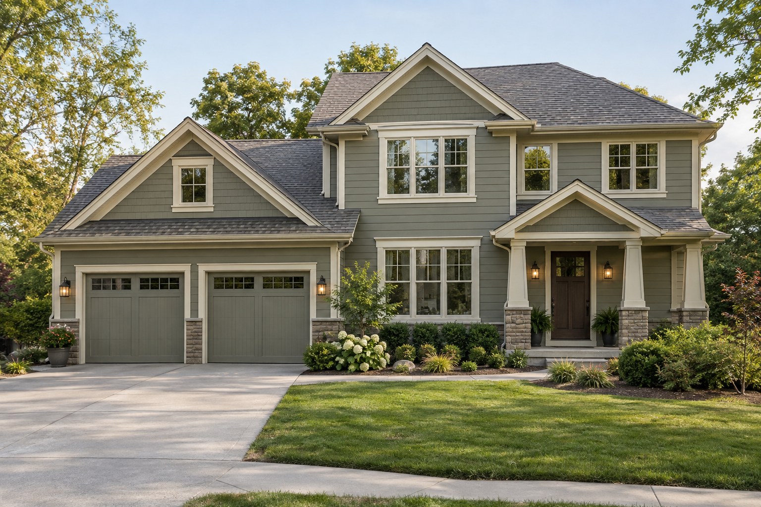
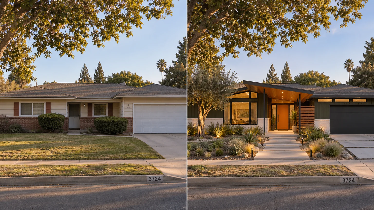
The additional low-canopy comparison below makes the entrance readable through a horizontal projection, warm material and a direct path. If a screen would narrow an already shallow landing or hide the door from the approach, this simpler treatment can provide the visual depth you need.
Before drawing a screen, mark the door swing, the usable landing and the route from the driveway. Check the view toward the house number and doorbell. A feature that looks attractive head-on may feel obstructive when approached from the side; review both views before committing to its position.
Let a timber entrance suit the landscape
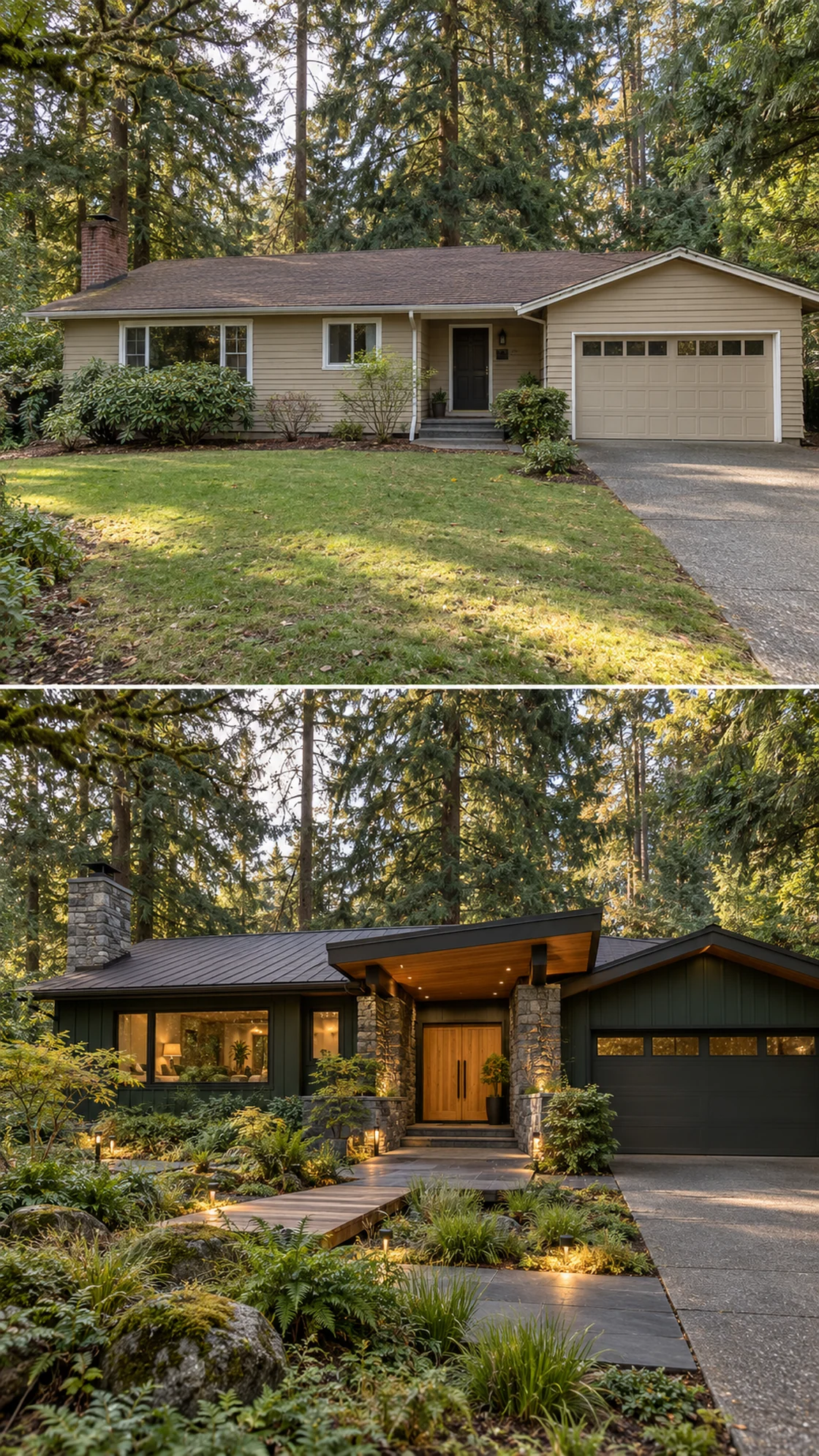
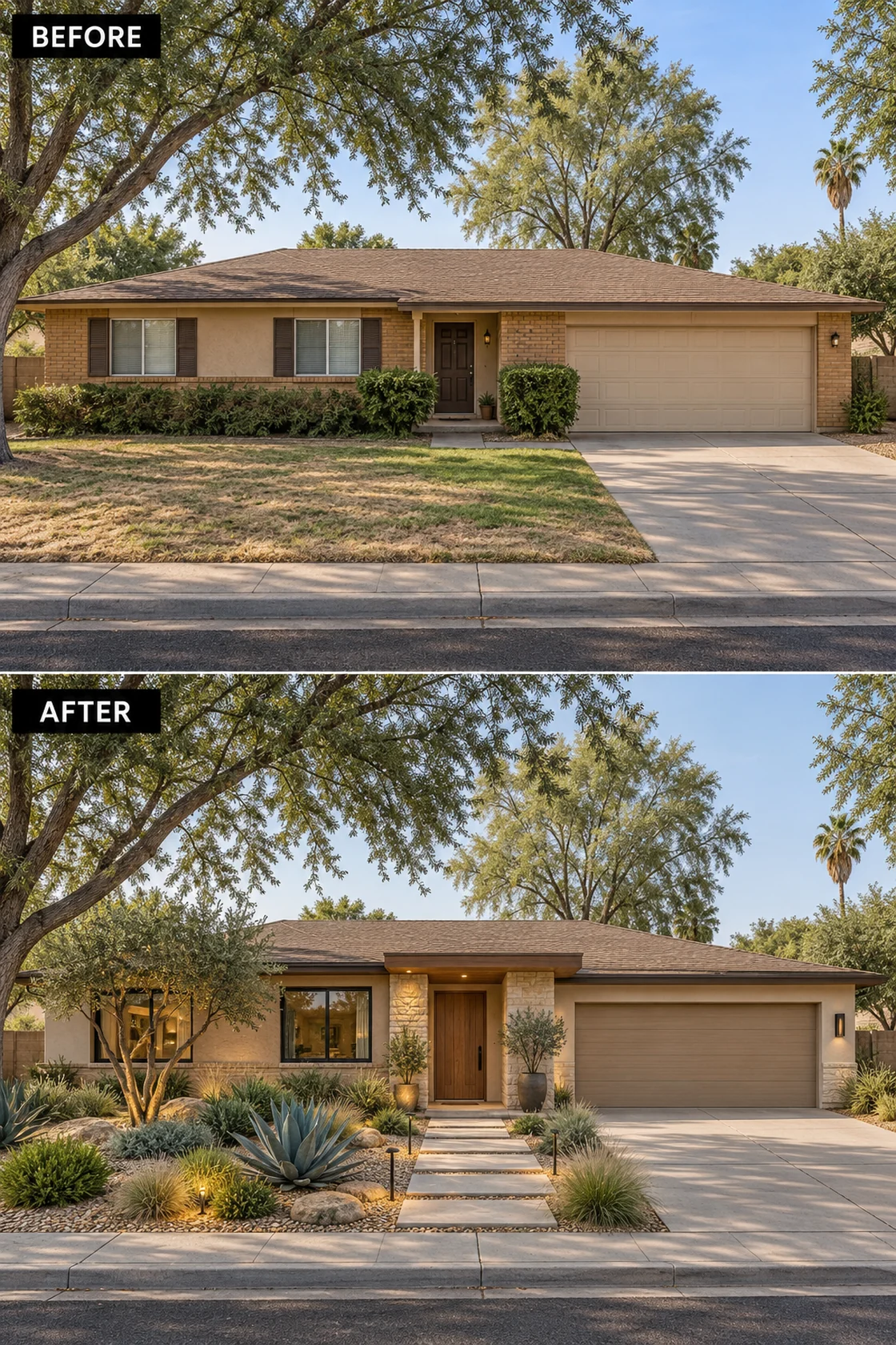
The wooded comparison uses a timber-lined entry against deep green walls. Its stronger sense of arrival comes from the relationship between warm wood, shadow and planting, without relying on a patterned masonry panel. This is a useful option when the surroundings already contain substantial visual texture.
Concentrate the timber in one legible entrance area and keep adjacent details simpler. Evaluate the proposed wood at the actual exposure: a protected soffit and an exposed post face experience different conditions. Discuss suitable materials, detailing and upkeep with the supplier rather than selecting solely from the rendering.
Explore more ranch exterior design ideas to compare screens, canopies and quieter entrance treatments.