Modern Mediterranean Exterior Colors: Warm Stucco, Stone and Muted Accents
Explore warm stucco, pale stone, olive and burgundy accents for Mediterranean-inspired homes, plus paint colors to sample beside your fixed finishes.
Warmth comes from the whole composition
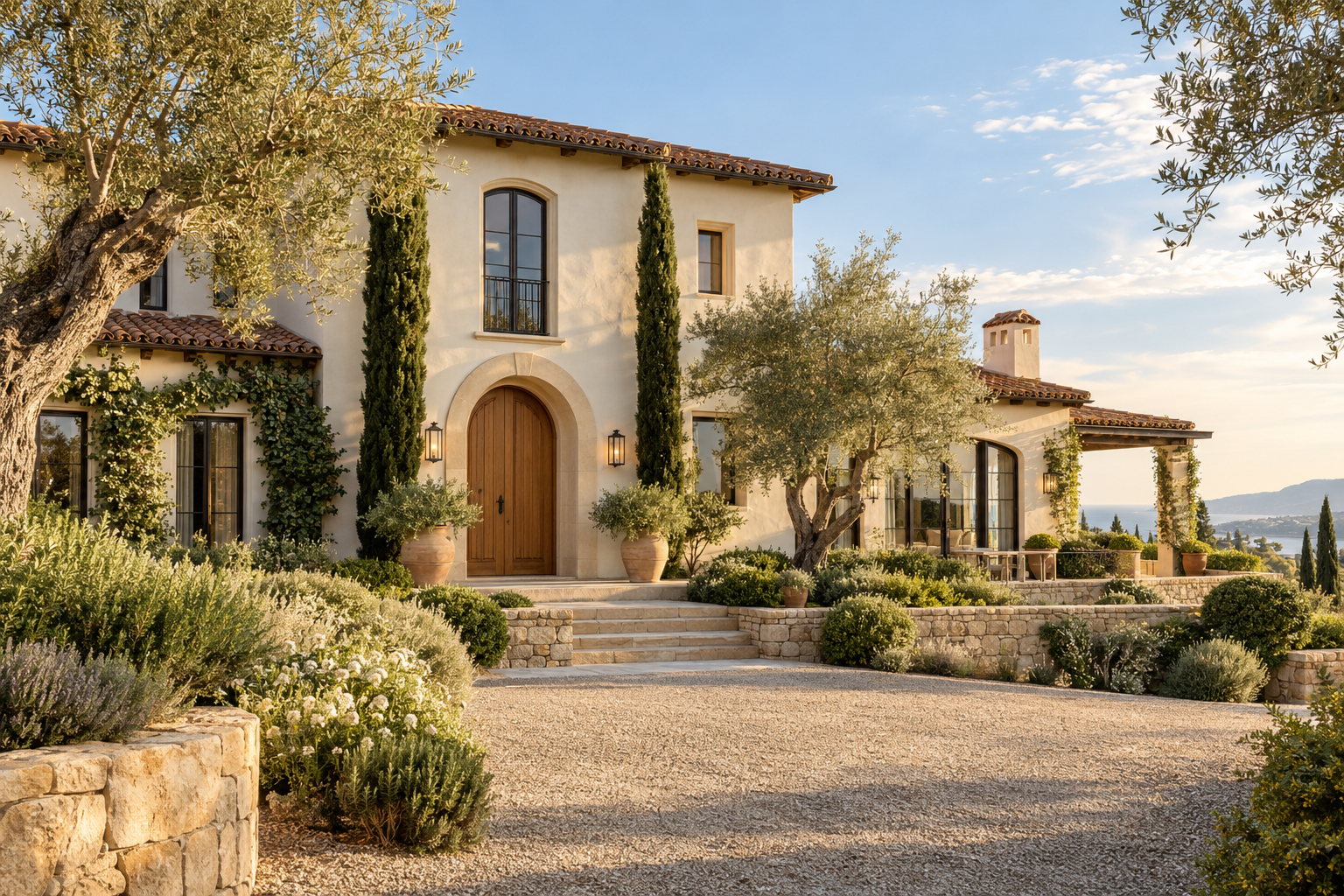
A Mediterranean-inspired exterior can feel contemporary without losing its warmth. Pale stucco, textured stone, clay roof tones and timber all belong to a softer material family, but the result depends on their proportions. Too many accents can make a simple house feel overly themed.
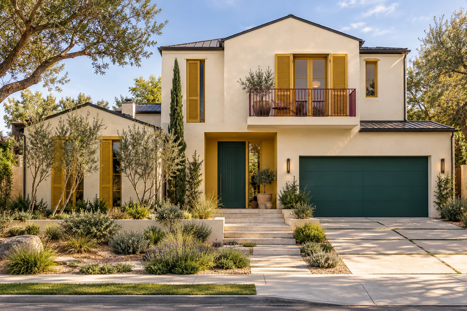
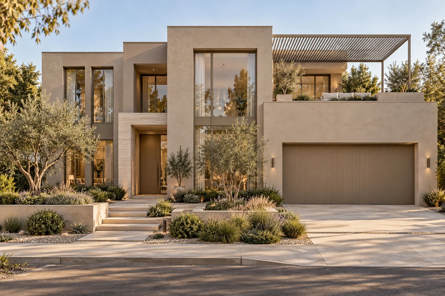
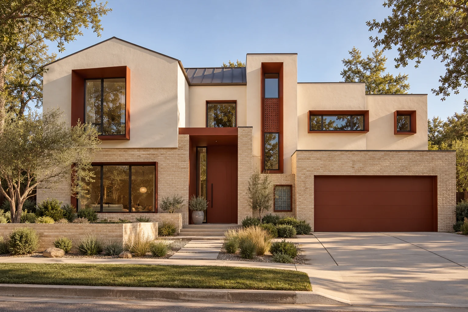
These three homes take different approaches: one uses tile and olive details, another relies on stone and deep openings, and the third concentrates a richer color at the entrance. Use them to study relationships, rather than treating the appearance of any one rendering as a paint specification.
Keep stone placement connected to the building
The modern example uses pale stone on defined wall sections. The texture helps separate the building volumes, while smoother stucco keeps the wider surfaces calm. Deep openings do much of the work that contrasting trim might otherwise be asked to do.
For a new build, resolve the returns and wall depths alongside material placement. For a renovation, use existing recesses or clear changes in wall plane as starting points. Small isolated stone patches rarely create the same sense of substance as a finish that wraps a complete element.
Choose one place for expressive color
The burgundy entry makes the front door area recognizable without darkening every wall. Its relationship to the warm garage finish is important: both belong to the earthy side of the palette, but they are used at different scales.
A colored entrance can be a good option when the architecture is already restrained. If the roof is strongly orange or red, check the accent against it carefully. Two attractive colors can still compete when their warmth, saturation or placement is too similar.
Treat the garage as part of the wall composition
On the tiled-roof example, the olive garage is a substantial color field. It works as a quieter alternative to bright white or strong black. The planting repeats some of its green character, helping the door relate to the setting rather than looking like an isolated feature.
A greener garage is not right for every Mediterranean home. If the door is especially large or prominent, a muted wall-related neutral may be more appropriate. Judge it from the street, including the driveway and any retaining walls.
Paint samples for a warm, restrained palette
For the warm neutral stucco walls, sample Sherwin-Williams Natural Linen SW 9109 beside the actual stone and roof tile. It offers a sandy direction to explore without treating the exterior as stark white. Texture and deep shadow can alter how the color reads, so use the intended coating on a representative surface.
For the tiled-roof house with an olive garage, Benjamin Moore Tate Olive HC-112 is a grounded green to compare with the planting and terracotta. For the contemporary house with a burgundy entrance, Sherwin-Williams Sommelier SW 7595 offers a deeper wine-brown direction for a painted door or entry accent. It may read substantially darker in a shaded recess.
Sherwin-Williams Cavern Clay SW 7701 is a terracotta direction to sample for a suitable painted garage or smaller accent where you want to echo clay tones. It is not a substitute for selecting an actual tile or metal finish. Choose the accent that suits the particular home rather than combining every suggestion; none is a confirmed specification for the images.
Sherwin-Williams Natural Linen SW 9109
Benjamin Moore Tate Olive HC-112
Let the landscape complete the palette
The lighter walls in these examples are softened by planting, pale ground finishes and warm wood. Landscaping should support the approach to the entrance and preserve the important views of the architecture. Plant choices still need to suit the local climate and available maintenance.
Before ordering, put the stucco, roof, stone, timber and painted accents together in ordinary daylight. The most successful warm palette is not necessarily the most beige one: it is the one where each finish has a clear role and the entrance remains easy to read.