Pale Stone House Exteriors: Choosing Colors for a Gray Roof
Pair pale stone with a gray roof, warm trim and dark windows. Explore three gabled homes and Benjamin Moore and Sherwin-Williams colors to sample.
Start with the stone, not the paint chip
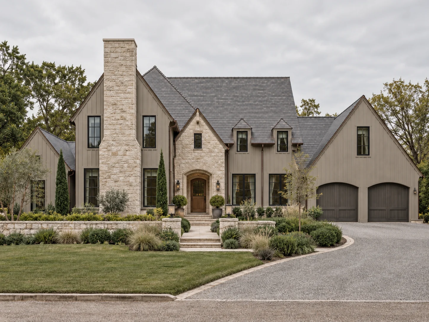
A pale stone exterior may look almost white from the street, yet contain cream, sand, gray and soft brown at close range. Those small variations matter when choosing trim or a painted wall beside it. A white that looks beautiful on its own can make the stone appear yellow; an overly cool gray can make the same stone look unexpectedly pink.
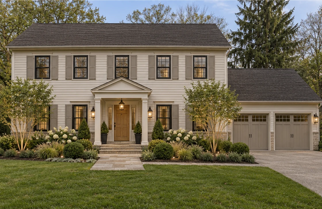
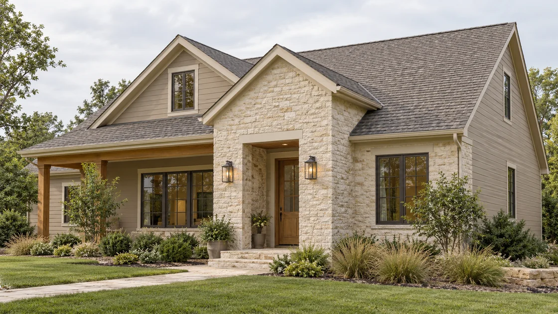
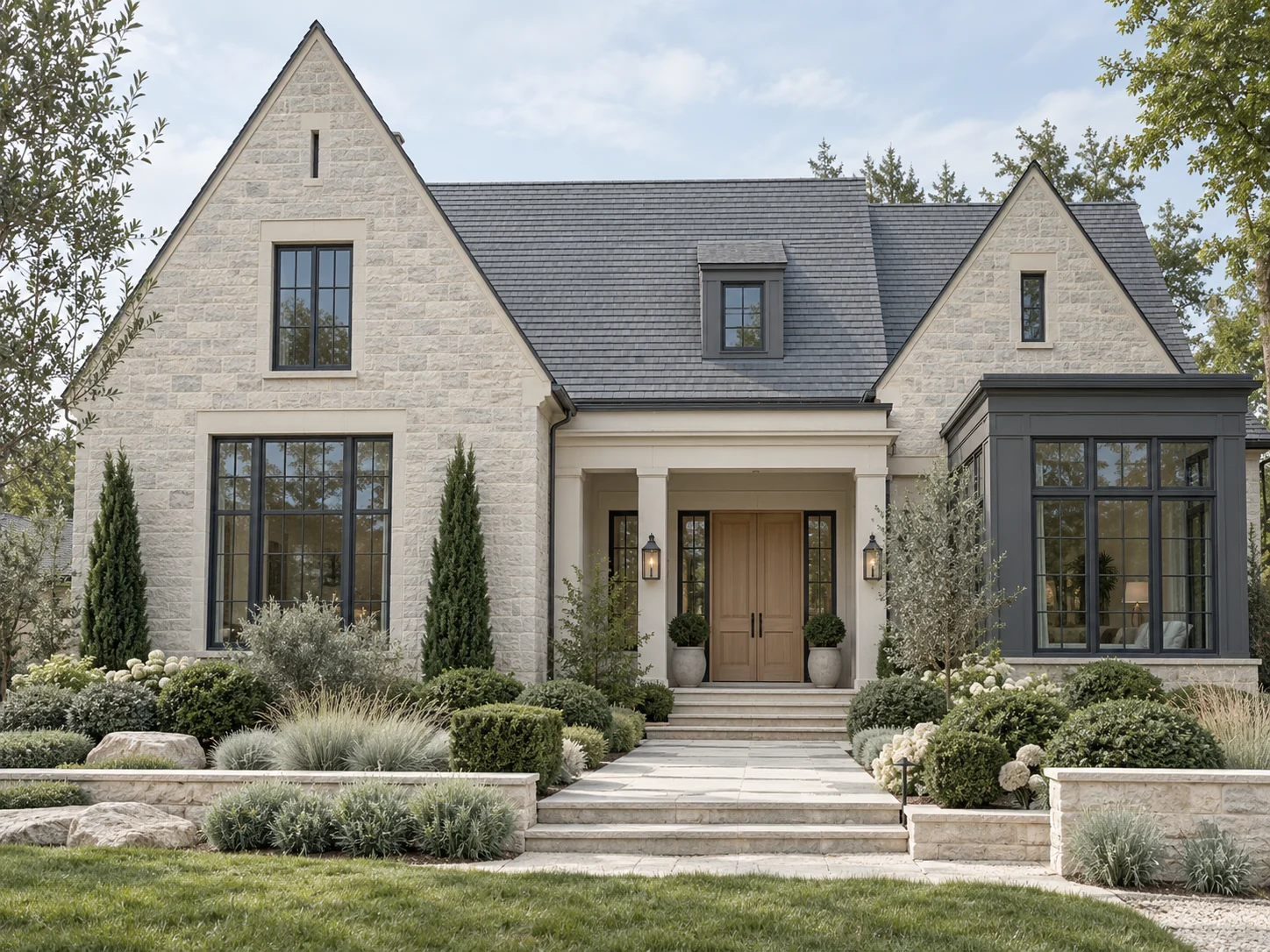
The three homes here show a quieter approach: pale masonry, gray roof surfaces and dark window frames. Their interest comes from gables, recessed openings and the texture of the walls. The paint suggestions below are starting points for a similar palette, not confirmed specifications for these images.
Read the roof and masonry together
Before choosing a color, put a roof sample beside several pieces of the stone. Look for the shared tones rather than trying to match one isolated fleck. The roof can be cooler than the wall, but a middle tone in the masonry should help bridge them.
Also check the amount of contrast. A dark roof gives pale walls a defined outline. A medium gray roof creates a gentler transition. Neither is automatically better: the right balance depends on the size of the roof, the depth of the eaves and how much of the house is visible from the street.
Let the gables remain the main feature
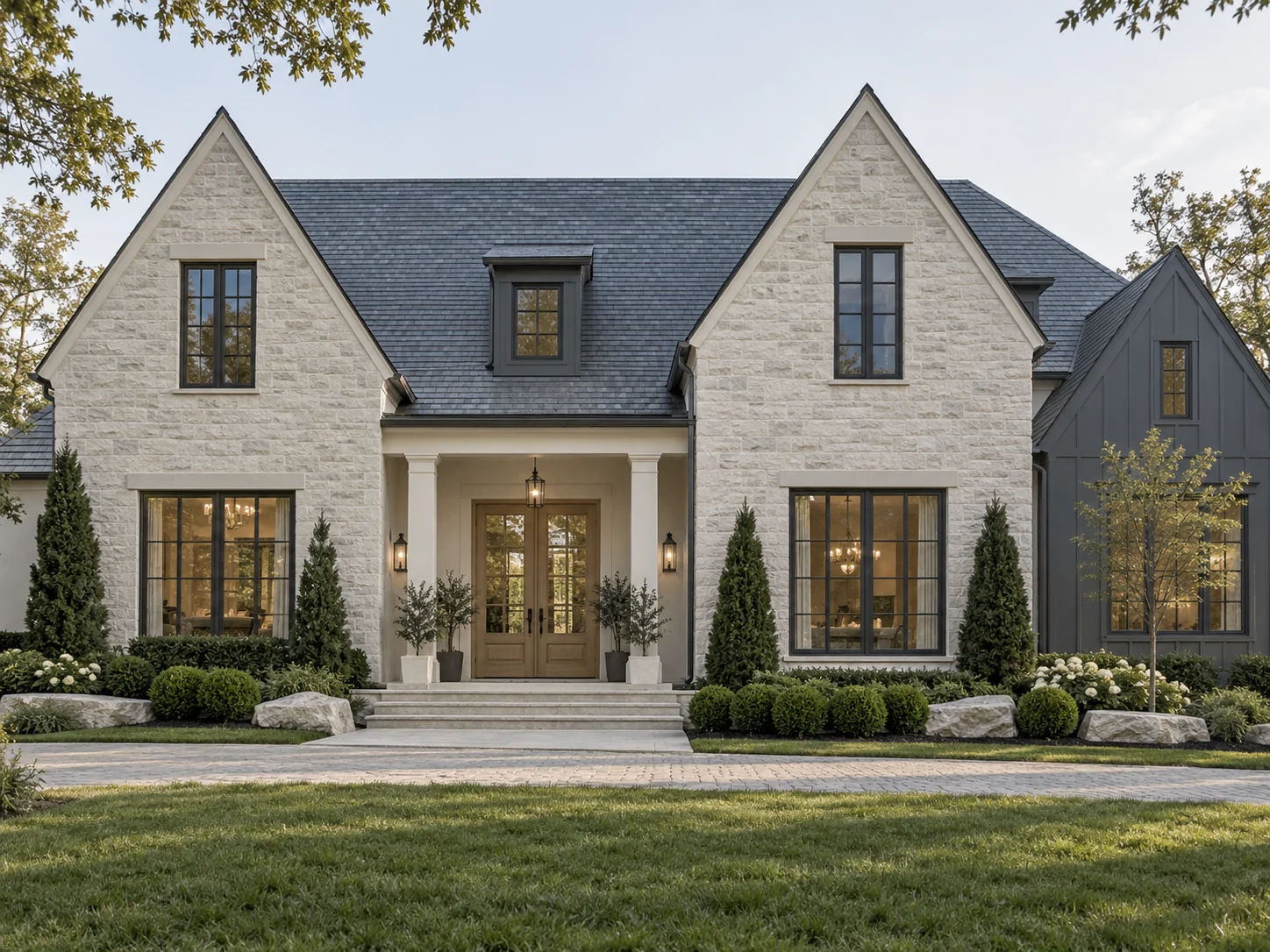
In the second example, the repeated gables already supply a strong rhythm. Introducing a different finish on every peak would make the eye jump between materials instead of reading the whole house. Keeping the masonry consistent allows small changes in height and depth to remain visible.
The dark windows support that rhythm without needing dark outlines around every corner. For a renovation, this is a useful distinction: emphasis can come from a few important openings rather than contrast applied everywhere.
Use the entrance to introduce depth
The third home has a shallow portico that frames the door with a clean rectangular opening. Its shadow gives the entrance presence while staying close to the wall color. This is particularly useful when the existing stone is already textured or varied.
A deeper door finish, restrained lighting and a clear approach can complete that focal point. There is no need to add a second stone solely to make the entrance stand out.
Paint colors to put on your sample board
For the pale gabled houses, sample Benjamin Moore Seapearl OC-19 on painted trim or an adjacent painted wall. Its gray undertones make it worth comparing with the gray roof and the cooler flecks in the stone. It may feel too cool beside strongly creamy masonry, so check it against several stone pieces rather than a single sample.
Benjamin Moore Pashmina AF-100 offers a deeper neutral direction for a garage or secondary painted surface, especially where a bright white would separate it too sharply from the masonry. Sherwin-Williams Iron Ore SW 7069 is a charcoal option for a front door or limited dark detail. Compare it with the actual window finish; paint should not be assumed to match a factory frame. These are sample directions, not confirmed colors in the images.
Check the palette in ordinary daylight
View large samples on the sunny and shaded sides of the house. Overcast light, reflected lawn color and deep eaves can change the relationship between the same finishes. Screen images are helpful for judging placement, but physical samples are essential for judging color.
For a new build, settle the masonry and roof direction before finalizing smaller painted details. For a renovation, let the materials that are staying establish the limits of the new palette. The result should feel like one house rather than a sequence of independently selected products.