Two-Tone House Exterior Ideas: How to Combine Colors Beautifully
Find two-tone house exterior ideas with four Sherwin-Williams palettes. Plan color placement, trim and garage finishes around your roof and architecture.
Two paint colors can make a house feel more intentional, or divide it into pieces that never quite belong together. The difference usually comes from placement. A darker upper story, a painted gable or a contrasting garage is successful when it clarifies the architecture rather than simply adding another color.
My starting point for two-tone house exterior ideas is a photograph of the whole elevation. Before choosing shades, I mark the wall planes that could reasonably receive each one. A good scheme should still make sense when you step back far enough that individual trim details disappear.
Where should the second exterior color go?
Look for a projecting entrance, a recessed garage wing, a clearly defined gable or a change in cladding. These give the second color a physical purpose. A corner or material transition is usually a more convincing boundary than an invented line halfway through a continuous wall.
Two-tone does not require an equal split. One color can remain dominant while the second occupies a smaller architectural volume. I would compare a restrained option before assuming the entire second story needs contrast. A small, meaningful accent may give the home enough definition without making it look taller or heavier.
Work with volumes, not individual windows
Avoid painting isolated rectangles around every opening unless those rectangles are real architectural features. Color cannot easily create depth where the wall is flat. Too many contrasting outlines tend to make windows, downspouts and garage openings compete for attention.
Instead, try coloring a complete porch recess or projecting bay. Consider its visible side wall as well as its front. On a corner property, the color arrangement needs to continue convincingly around the house; a striking front view should not become an arbitrary patch when seen from the driveway.
Four Sherwin-Williams combinations to sample
These are independent design recommendations using exterior-available colors, not manufacturer-approved combinations. Your roof, masonry, exposure and coating system still need consideration. None of the following dark colors should be assumed suitable for existing vinyl siding, PVC components or factory-coated frames without separate manufacturer approval.
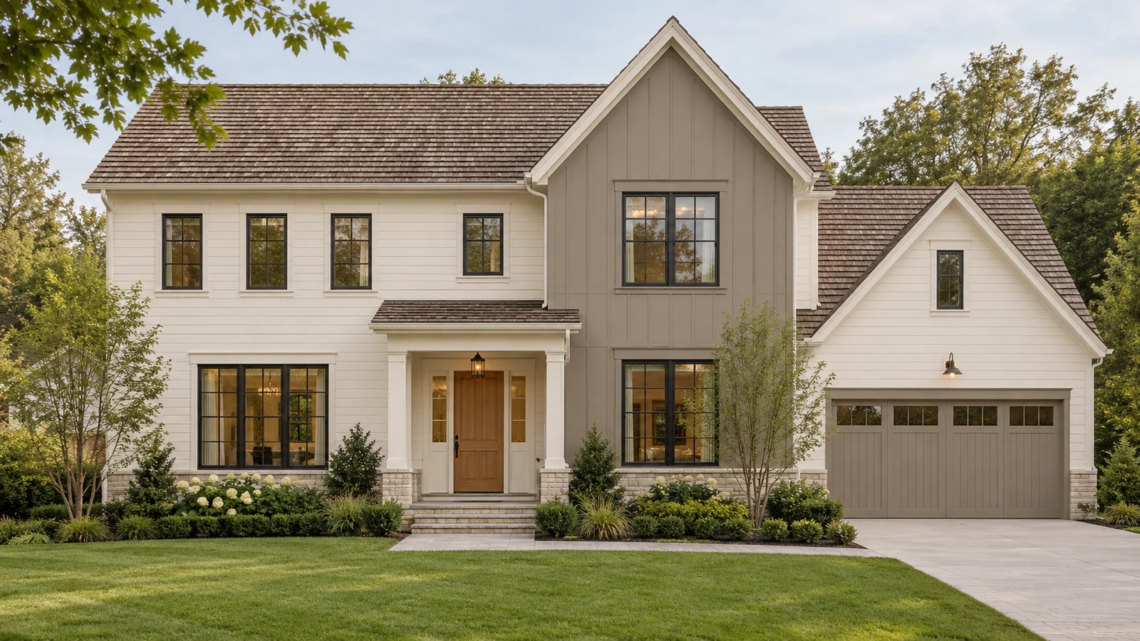
Alabaster SW 7008 + Dovetail SW 7018: refined traditional
Try Alabaster on the main siding and trim with Dovetail on one substantial secondary volume. The warm light body and deeper gray create a quieter alternative to a sharp black-and-white scheme. A natural timber entrance can bring warmth without another painted accent.
For a garage within the Dovetail volume, begin by matching the garage to that wall. For a garage in the Alabaster body, compare a body-colored door first. Carrying the dark color onto a separate garage simply to repeat it may shift attention away from the entrance. Check the scheme against brown-gray shingles and any retained brick.
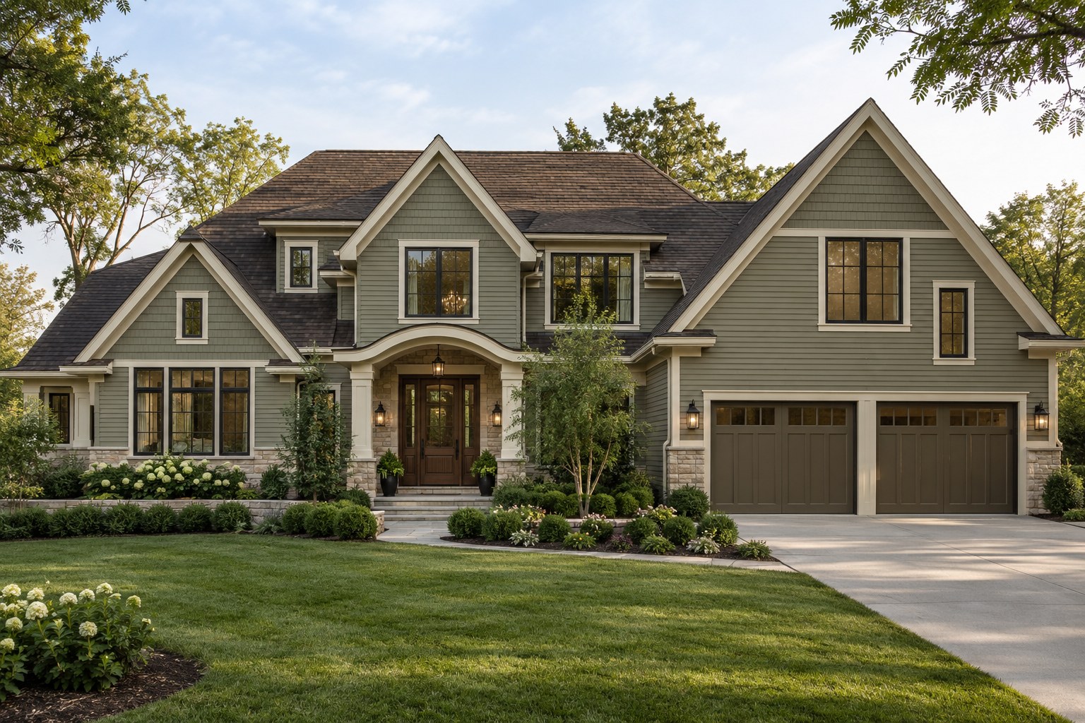
Shoji White SW 7042 + Pewter Green SW 6208: modern organic
Shoji White can keep the larger wall areas soft while Pewter Green defines an entrance wing or a smaller gable. Timber, warm stone and restrained bronze-colored fixtures can connect the palette to the landscape. I would keep the trim close to Shoji White rather than introducing a cooler white by default.
For a contemporary home, the green works best on a complete recessed or projecting volume. For a traditional home, it may be more effective as the smaller architectural accent. Compare how much green is visible from the street before extending it to shutters, garage and every door.
Oyster White SW 7637 + Naval SW 6244: clear architectural contrast
Oyster White and Naval create the strongest light-dark relationship of these four ideas. Try the navy on a contained volume with enough visual weight to carry it, while keeping the larger body and most trim light. Warm wood at the front door can soften the composition.
A navy garage can become the darkest, most noticeable part of a house. That may be appropriate when the garage belongs to a recessed lower volume, but less useful when it already dominates the front. Review a simpler light garage option rather than assuming every accent must match.
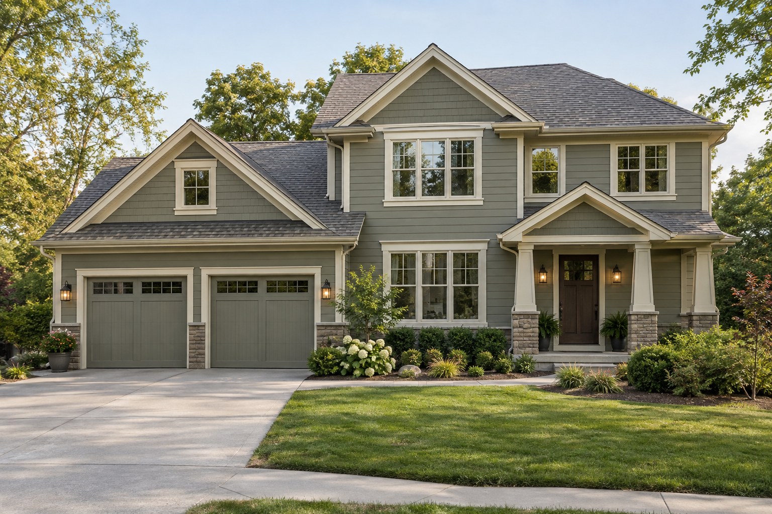
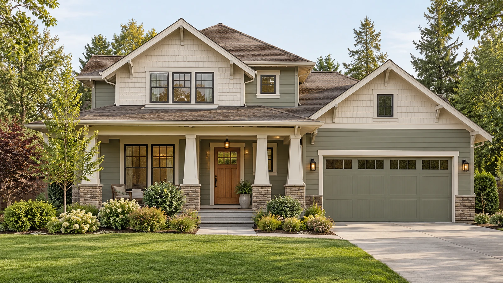
Evergreen Fog SW 9130 + White Duck SW 7010: softer Craftsman character
Evergreen Fog gives a muted sage-gray direction for the main lap siding, with White Duck on a shingle-clad gable or substantial porch trim. The contrast is gentler than navy and ivory, which can suit smaller houses with a lot of existing detail.
On a Craftsman, preserve the distinction between the body, gable and porch without painting every small bracket a different shade. Match the garage to its surrounding wall when you want the front door and porch to lead. A brown-toned roof may support the earthy character, but the actual roof sample should decide the pairing.
Two-story houses: avoid an accidental horizontal split
Painting the entire upper floor darker can emphasize the top of the house. This is not automatically wrong, but it deserves a full-elevation comparison. Window placement, roof size and the width of the lower story influence whether the result feels grounded or top-heavy.
A projecting two-story volume can be a better place for contrast than the upper floor alone. If the house already changes from brick below to siding above, use that genuine material division as one option. Do not force another horizontal line through continuous siding solely because two-tone photographs are popular.
Split-level houses: connect the levels
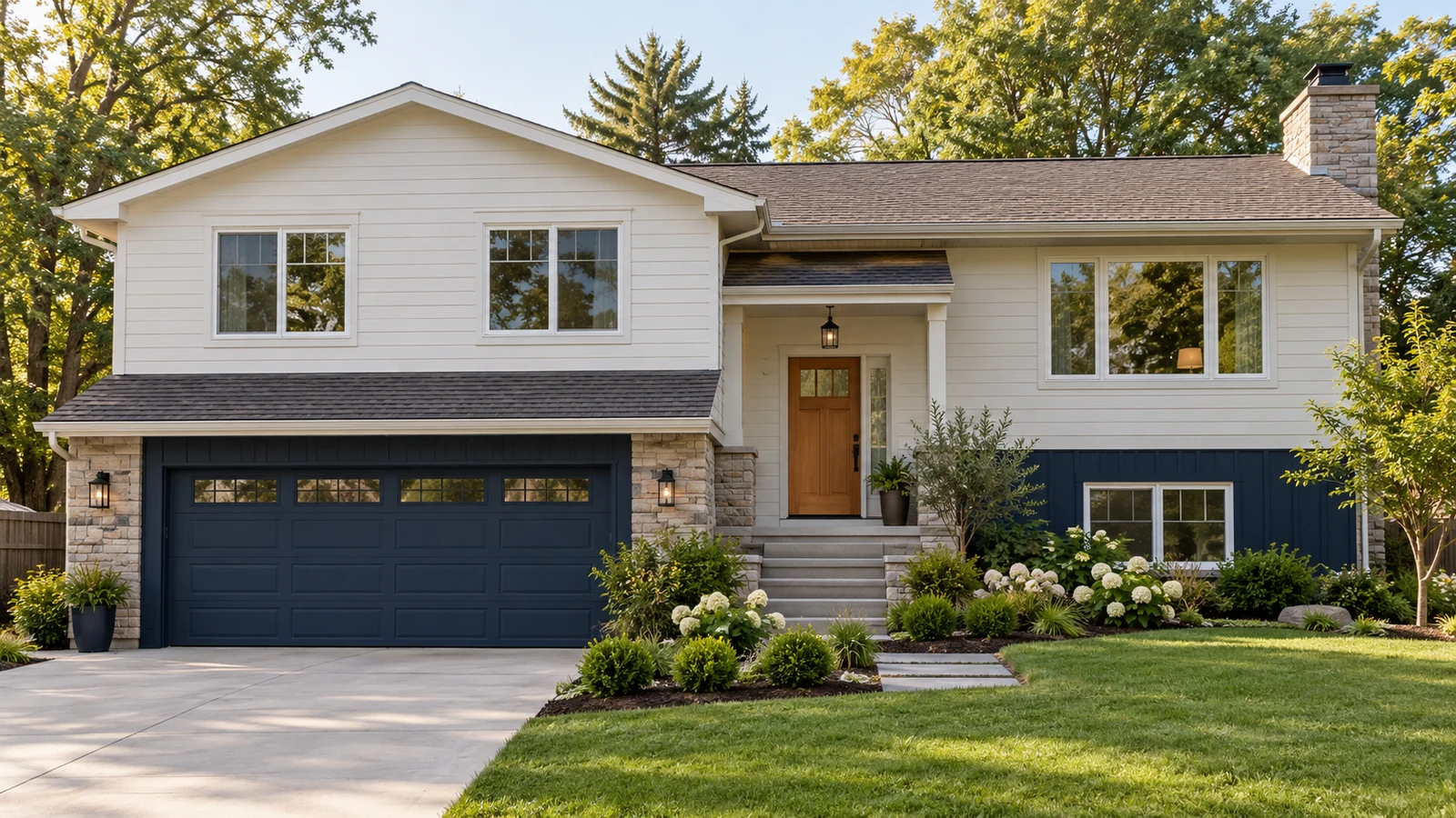
A split-level has several heights and often a prominent lower garage. A darker receding base with a lighter upper wall can make sense when the volumes already read that way. If the upper story projects far beyond the base, compare the reverse or a lower-contrast pairing.
Keep the entrance visible between the levels. A clear path, an appropriate light and a warm door may do more than adding a third wall color. Study the side elevation too: colors should follow the actual forms instead of ending at the edge of the front photograph.
Choose trim and garage colors as part of the plan
A two-tone body does not require two-tone trim. One quiet trim color often ties the composition together. Existing white windows can be a useful reference, but that does not mean all fascia must become the brightest element. Compare the trim against both body colors and the roof.
For the garage, begin with the surrounding wall color. Then compare an alternative if the door has architectural character worth emphasizing. Specify siding, trim, fascia, eaves, shutters, entry door and garage separately in a finish schedule. This prevents an installer from guessing what 'accent color' means on an unlisted surface.
Coordinate the roof before approving contrast
A large roof is already a major color field. Warm brown shingles, blue-gray shingles and terracotta tile respond differently to the same paint pairing. Include gutters, stone and brick in the sample group rather than deciding from two paint chips on a white table.
Try the scheme in a simple visualization before buying paint. Keep the photograph's architecture and light unchanged while comparing color placement. A brighter sky or different landscaping can make one option look better for reasons unrelated to the paint arrangement.
Use my guide to testing exterior colors in real light to plan a meaningful sample comparison.
Test both colors together outdoors
Use generous movable samples, then a representative test of the intended coating where appropriate. Check them beside the roof and fixed masonry in sun, shade and porch shadow. Compare the two colors together: a gray that looks warm alone can appear cooler beside a creamy white.
Confirm substrate suitability with the coating and component manufacturers. A color listed for exterior use is not approval for every siding or window material. Ask the painter to document the chosen product, color, sheen and surface assignment before work begins.
Two-tone exterior questions
### Is two-tone paint suitable for a small house? Yes, when the contrast supports a clear feature. A smaller secondary area or gentler contrast may work better than dividing a compact elevation into equal dark and light bands.
Should shutters match the darker siding?
They can, but only if shutters suit the windows and the extra repetition improves the composition. Some houses look calmer without decorative shutters. Compare both options before buying new ones.
Do eaves have to match the trim?
No. Eaves can follow the trim or the adjacent body depending on the roof and style. Make the assignment explicit and compare it from the street rather than leaving it as an automatic choice.
Make the color placement intentional
Choose the architectural division first, then the palette and finish schedule. If you mainly need color selection, a consultation can help coordinate the fixed finishes. If the project also changes materials or proportions, a complete exterior design makes it easier to see how all those decisions work together.
Explore my exterior design portfolio for more examples of coordinated home updates.
Primarily choosing paint colors? Ask about my Color Consultation ($200), which provides color guidance without visualization.
Further reading
Pewter Green SW 6208 — manufacturer color reference
Naval SW 6244 — manufacturer color reference
Alabaster SW 7008 — manufacturer color reference
White Duck SW 7010 — manufacturer color reference
Dovetail SW 7018 — manufacturer color reference
Shoji White SW 7042 — manufacturer color reference