Exterior Paint Colors That Work With White Windows
Keeping your white windows? Explore warm greige, sage, warm gray and darker exteriors—and learn how to coordinate the roof, masonry, trim and front door.
Keep the white windows—and design around them
You do not need black windows to give your house a beautiful exterior makeover. Existing white vinyl or factory-finished windows can work with a wide range of wall colors. The key is to include their actual finish in the palette from the beginning, alongside the roof and any brick or stone you plan to keep.
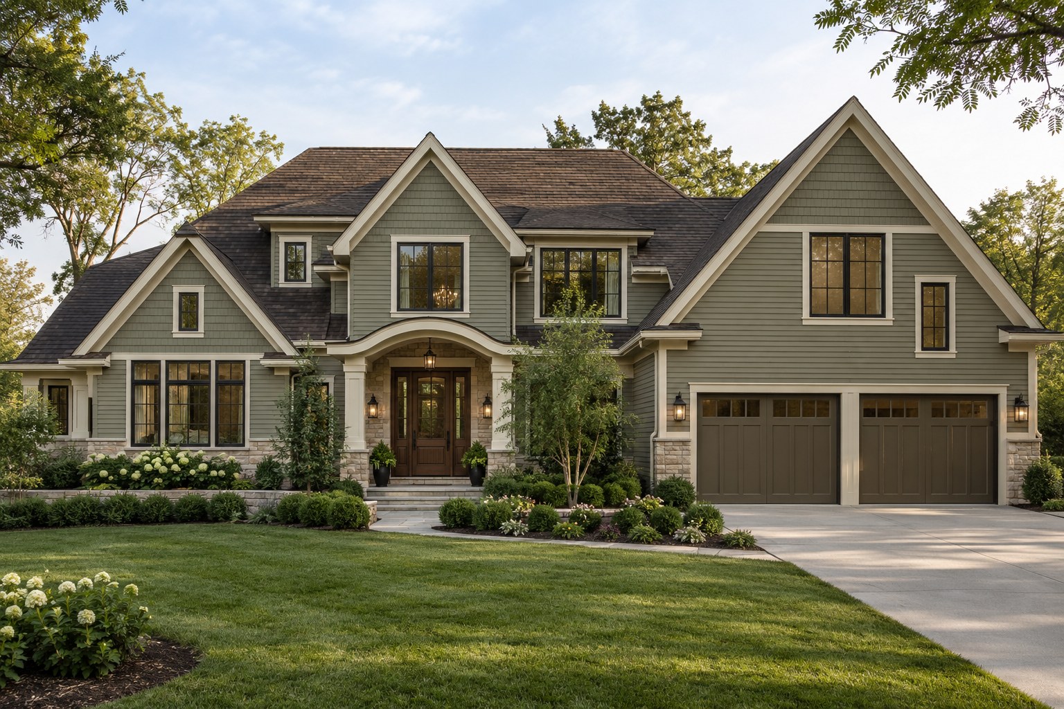
Warm greige and taupe offer a softer contrast; muted sage adds color without overwhelming the facade; warm gray creates a restrained neutral scheme; charcoal and deep olive make the white outlines more prominent. Choose the direction that suits your fixed materials and the proportions of your house, rather than copying a color from an unrelated photograph.
What to choose first: a practical order
Start with the surfaces you are keeping. White windows are a fixed reference throughout this process, not a finish to reconsider at the end.
- Roof: identify its overall color from the street. A brown or warm gray roof will suggest different companions from a cool charcoal roof.
- Fixed brick and stone: look at both the material and its mortar. Notice whether the overall impression is red-brown, creamy, sandy, gray or mixed.
- Main body color: narrow the siding or stucco to colors that relate to those fixed surfaces and look intentional beside the white frames.
- Trim: compare samples directly against the actual window white. Decide whether the outer casing should blend with the frame or create another outline.
- Accents: select the front door, shutters and garage as part of one composition. Give the entrance emphasis and decide whether the garage should recede.
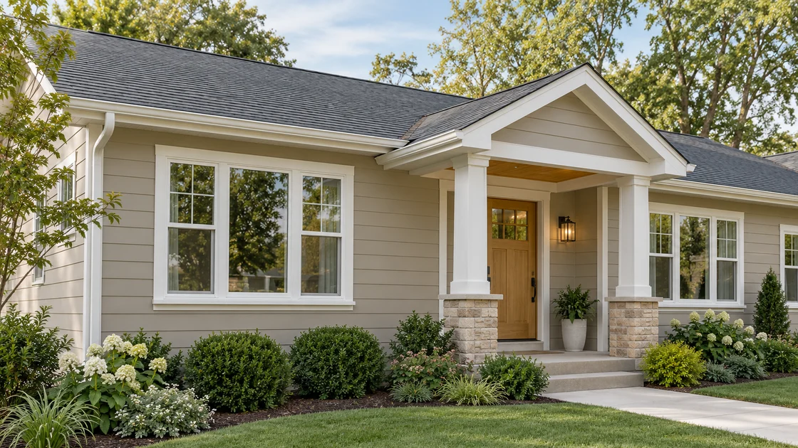
Warm greige or taupe: a softer neutral direction
A light-to-medium warm greige can make white windows feel integrated without turning the whole house white. It is a useful starting point beside sandy stone, beige masonry or a warm roof, provided the undertones agree. The hero example pairs greige siding with slim white casing and a wood entrance, keeping the palette restrained.
Watch for neutrals that turn noticeably pink, purple or yellow next to your masonry. A very creamy trim can also make a crisp white frame look disconnected. Test the body and trim together; a warm wall color does not automatically need a warm cream surround.
Soft sage green: color with a quieter contrast
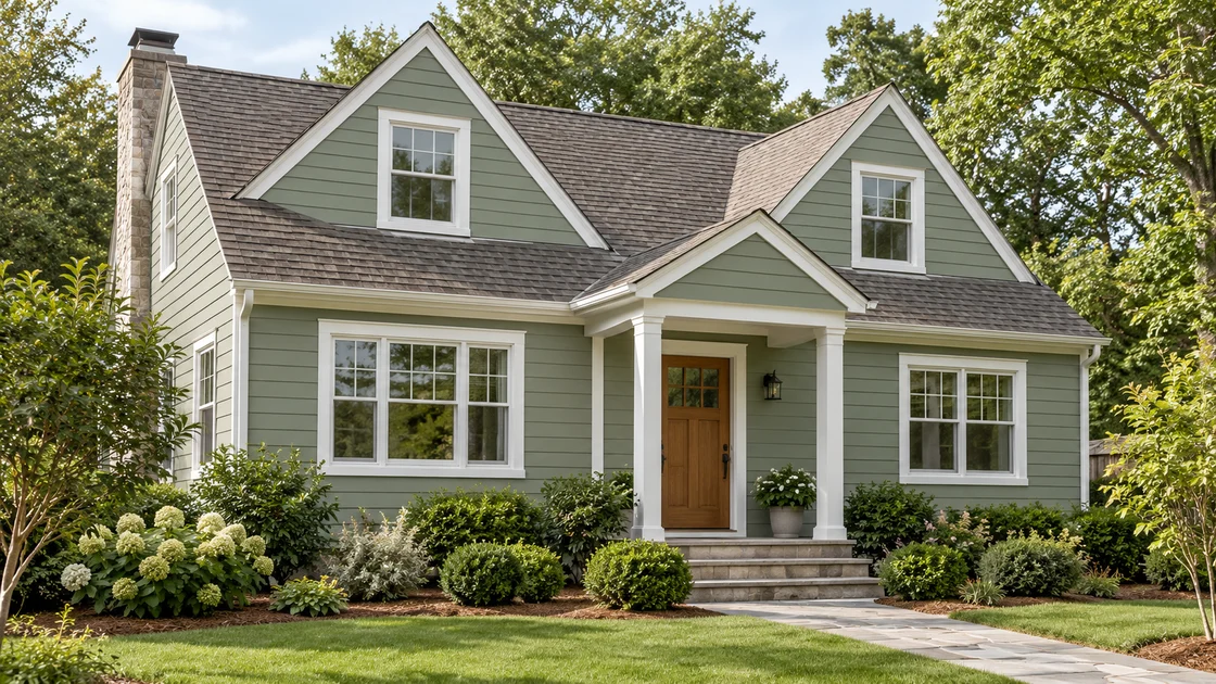
Choose a sage with enough gray in it to feel calm across a large wall. White windows give the green a clean edge, while a timber door can supply warmth without adding another strong paint color.
Sage can be especially attractive beside warm gray shingles and some red-brown brick or earthy stone. It still needs testing: a yellow-green sage and a blue-green sage can behave very differently beside the same roof. Keep planting low enough that you can judge the actual wall color and window rhythm.
Warm gray: a balanced neutral with white frames
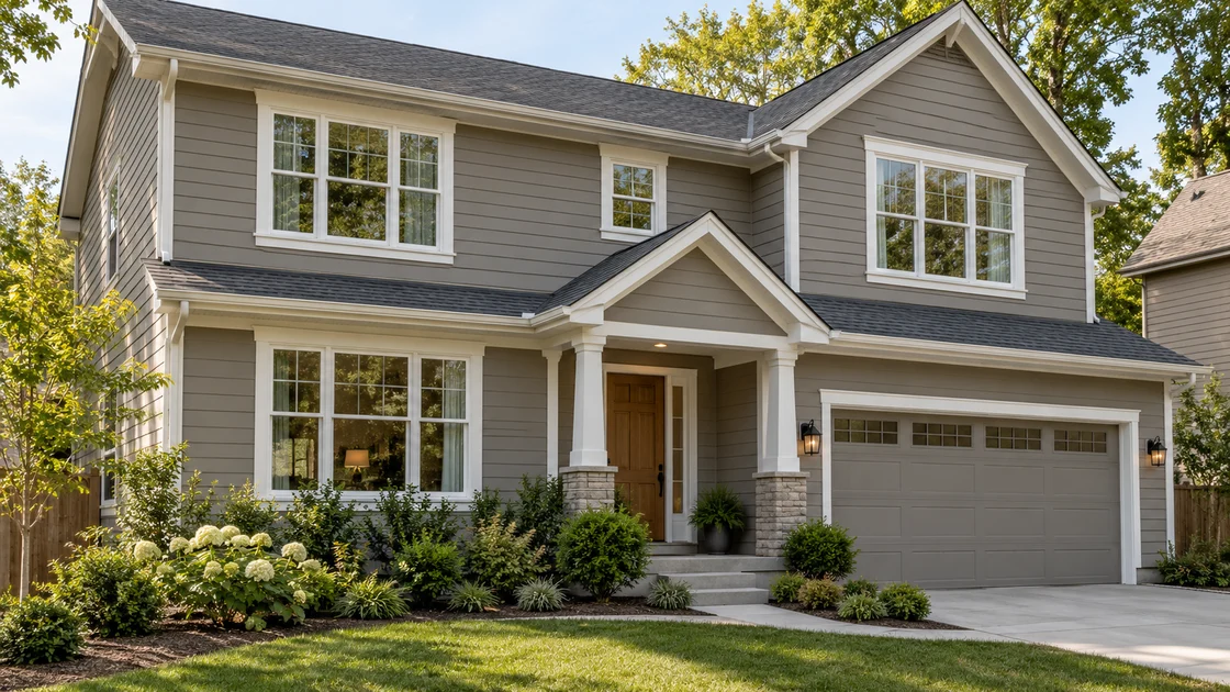
A gray with a subtle taupe undertone can provide a more neutral-looking alternative to sage or beige. Medium depth gives the white windows definition; a lighter gray makes their outline less prominent. Judge that contrast from the street, especially if the house has many small or closely spaced windows.
Avoid assuming that every gray will work. A cool blue-gray can feel separate from tan stone or a brown roof. Compare gray samples with the roof, mortar and actual white frame in one view before choosing.
Charcoal or deep olive: make the contrast intentional
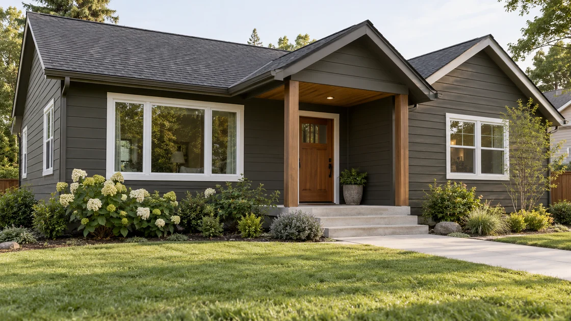
White windows can look beautiful against dark siding when their repetition feels balanced. A muted charcoal or deep olive makes each opening stand out, so this direction works best when you like the existing window proportions and placement.
Keep outer casing restrained if you do not want broad white rectangles around every opening. Coordinate the garage with the main body or a related subdued finish so its large area does not compete with the entrance. For any surface being repainted, confirm that the paint system and proposed color depth are suitable for the actual substrate before committing.
White window frames and surrounding trim are different surfaces
The manufactured frame and sash surround the glass. Exterior casing is the separate border around the opening; it may be painted wood, composite, metal wrapping or another material. Keeping a white window does not necessarily mean keeping every surrounding trim surface white.
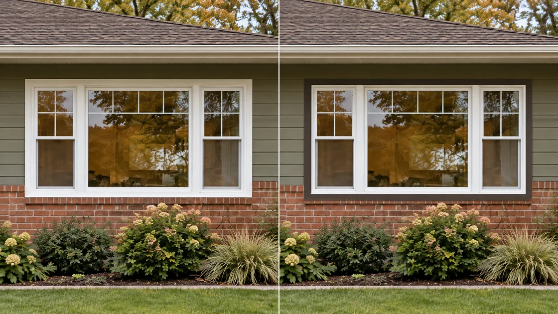
A slim light casing close to the frame color makes the opening read as one element. Dark outer trim leaves the white frame visible inside another border, as the comparison shows. Use that stronger outline deliberately; it does not create the appearance of a black window.
Check the instructions for your exact window model and trim material before painting. Andersen, for example, advises against painting or staining listed non-wood surfaces, including exterior cladding. Manufacturer guidance varies, so a rendering should never be treated as permission to repaint a factory-finished frame.
With brick or stone, let the fixed material lead
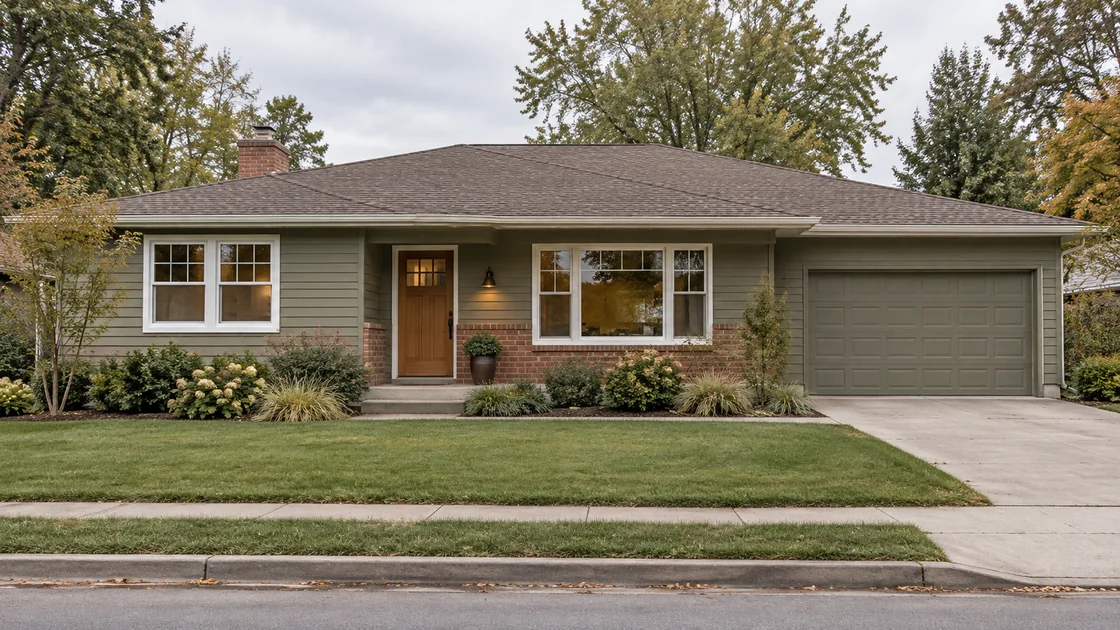
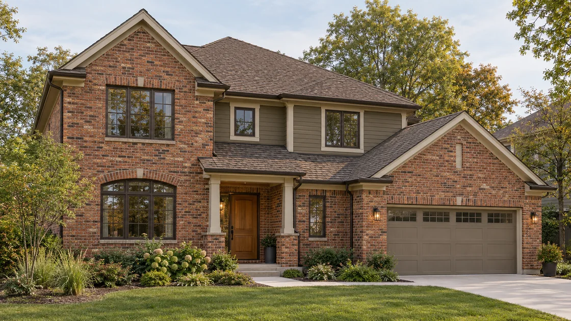
White frames alone cannot determine the right siding color. In this ranch study, the red-brown brick and warm roof narrow the choice. Muted olive-gray siding relates to those warmer surfaces, while the quiet garage and wood door keep the entrance readable.
Look at brick variation and mortar together rather than matching one isolated brick. With stone, compare the dominant background tone as well as the darker flecks. Keep material changes at existing architectural boundaries instead of adding new patches simply to introduce another color.
Test the complete palette beside a real window
View large body-color and trim samples together beside a window, keeping the roof and masonry in sight. Revisit them in morning light, afternoon light and shade, then step back to the approach. Check whether the trim looks too creamy beside the frame, whether the siding changes undertone and whether the windows attract more attention than the entrance.
Reduce your choices to two complete schemes before selecting an accent door color. Photographs and screen colors help you compare design directions, but they cannot confirm an exact paint match. These images are illustrative studies, not completed client renovations or manufacturer color samples.
Before requesting a design, record the window finish, roof and fixed materials that must remain. A useful exterior visualization should reflect those real constraints so you can compare a cohesive makeover rather than a house with different windows.