Exterior Color Trends 2027: 4 Sherwin-Williams Colors to Watch
Mary Jo’s 2027 exterior color outlook: explore Chatroom, Indigo Batik, Smokehouse and Pearly White, with practical ideas for stone, wood, trim and roofing.
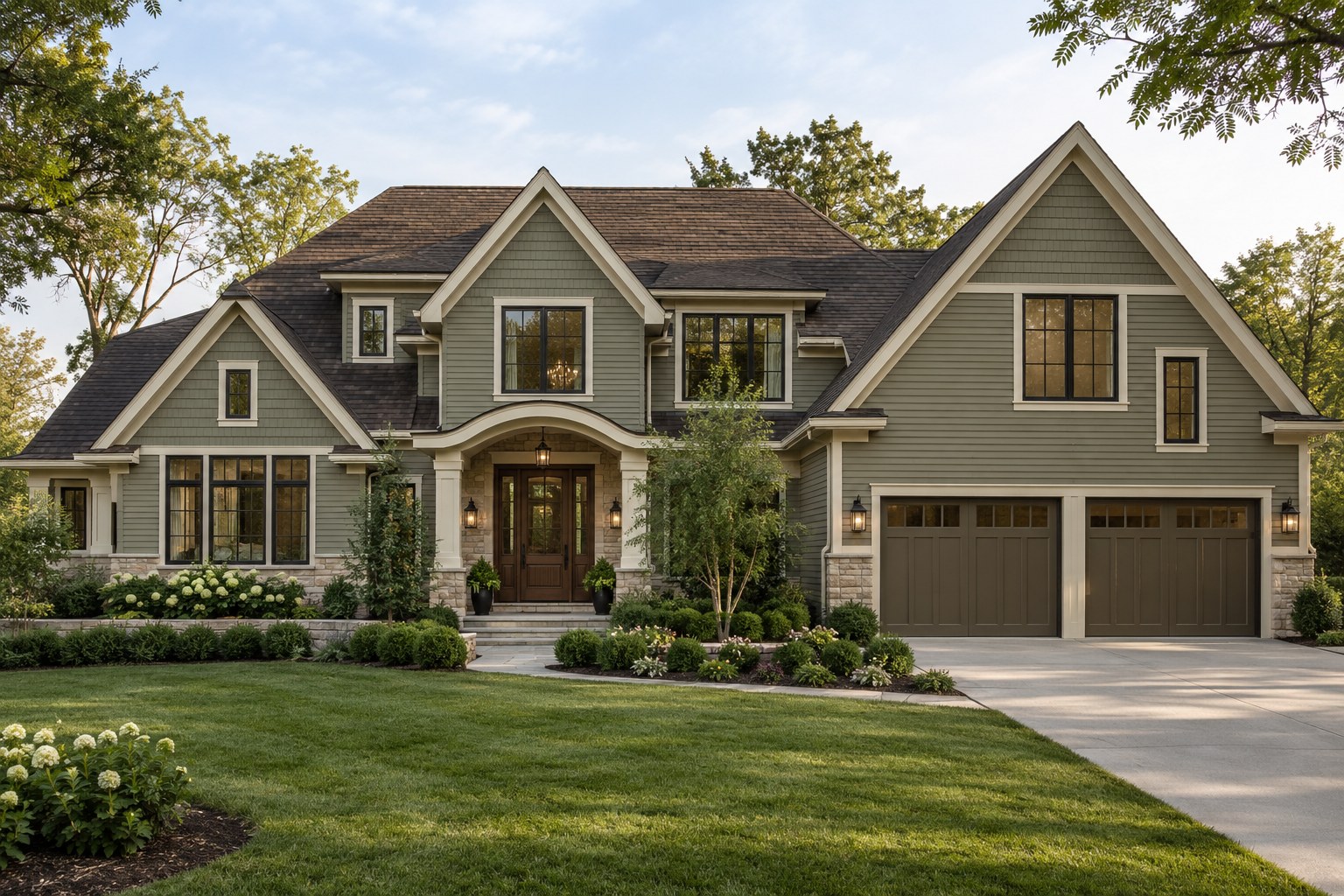
Looking ahead to 2027, the exterior palettes I would explore combine softer neutrals, earthy depth and richer color with natural materials. The aim is a home that feels settled and distinctive, rather than an exterior assembled around one fashionable paint shade.
This is my design outlook and shortlist for homeowners planning a renovation, separate from Sherwin-Williams’ official 2027 announcements. Four existing colors offer useful starting points: SW 6171 Chatroom, SW 7602 Indigo Batik, SW 7040 Smokehouse and SW 7009 Pearly White.
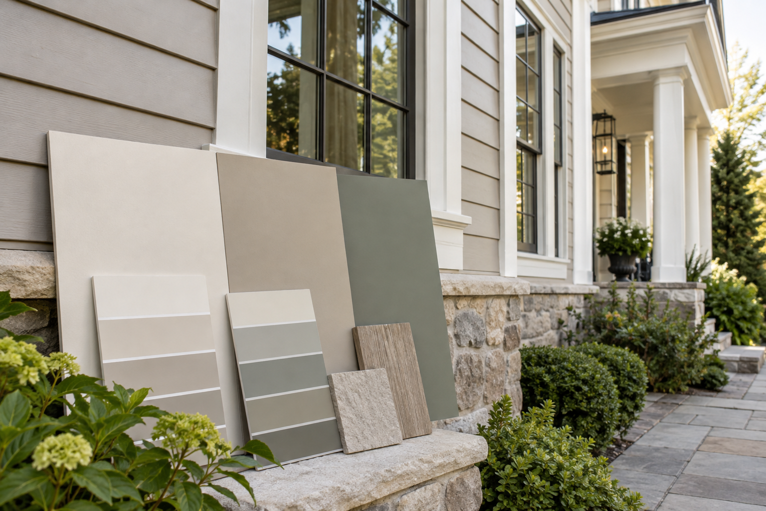
The accompanying architectural visualizations explore these palette directions. They are visual references, not exact paint matches. Lighting, your screen and the surrounding finishes all affect the apparent color; physical samples should guide the final selection.
What Sherwin-Williams Has Announced for 2027
Sherwin-Williams’ Rewild Colormix Forecast brings together 48 hues, including 10 Continuity Colors, with three design stories: Revive, Reignite and Reconnect. The official 2027 Color of the Year is Celery SW 6421, a soft herbal green with subtle yellow undertones.
The four colors in this article are my independent exterior shortlist. They are not four official Color of the Year choices, and the forecast is broader inspiration rather than a prescription for painting a whole house.
What I would take outside
Celery SW 6421 is listed for interior use and is excluded from my exterior recommendations, including doors and sheltered porches. Color of the Year status does not establish exterior suitability. White Duck SW 7010 is worth sampling for a quieter light siding or trim direction. Roycroft Bronze Green SW 2846 offers a deeper, earthier accent for a Craftsman entrance or selected trim. White Duck and Roycroft Bronze Green are also among the forecast’s Continuity Colors.
These are exterior design suggestions, not manufacturer-approved combinations. Start with your roof and masonry, then decide how much color the architecture can comfortably carry. An expressive interior palette need not become a whole-house exterior scheme.
Compare the Four Exterior Color Directions
A starting point for your shortlist, not a guaranteed match to existing materials.
ChatroomSW 6171
Muted green-influenced neutral; quiet and grounded.
- Use & architecture
- Main siding or tonal trim on Craftsman, transitional and updated traditional homes.
- Brick, stone & roof
- Compare with warm stone and timber. Check orange-red brick and pink stone carefully; a strongly warm roof can change the apparent undertone.
- Think twice when
- Less suitable if you want a clear, fresh green or a crisp cool gray.
Indigo BatikSW 7602
Deep denim blue; defined, colorful and composed.
- Use & architecture
- Selected siding, a gable, shutters or the front door on coastal, New England-inspired and Craftsman homes.
- Brick, stone & roof
- Consider the contrast with warm brick and pale stone, and compare directly with brown or weathered roofing. Keep trim and other accents restrained.
- Think twice when
- Broad dark walls may feel heavy on a shaded elevation. Confirm darker-color suitability for the siding material.
SmokehouseSW 7040
Gray-influenced warm brown; earthy depth rather than black.
- Use & architecture
- Main siding, a coordinated garage or architectural accents on ranch, rustic and contemporary Craftsman homes.
- Brick, stone & roof
- Explore with wood, warm masonry and brown or charcoal roofing. Compare with the actual mortar and stone; a shared warmth does not guarantee a match.
- Think twice when
- May feel too dark if the goal is a brighter facade, particularly below deep eaves.
Pearly WhiteSW 7009
Soft off-white with gray influence; light and restrained.
- Use & architecture
- Main walls or quiet trim on coastal, transitional and updated traditional homes.
- Brick, stone & roof
- Test against pale stone, retained brick and the roof. Compare adjacent whites: a warmer finish can make it appear cooler or grayer.
- Think twice when
- Not a substitute for a distinctly creamy white. Bright sun can make a pale facade appear much brighter than the chip.
Digital swatches use Sherwin-Williams’ published RGB reference values. Screens, light, texture and sheen change how color appears; compare physical samples outside before choosing paint.
SW 6171 Chatroom: A Nature-Inspired Neutral
Chatroom is a natural neutral with a noticeable green undertone. It offers an alternative to flat beige or cool gray when you want the walls to relate more gently to stone, timber and planting.
I would consider it for a transitional home, a contemporary Craftsman or an updated traditional exterior. Its appeal is the subtle color: it can make broad siding areas feel considered without demanding attention from every other element.
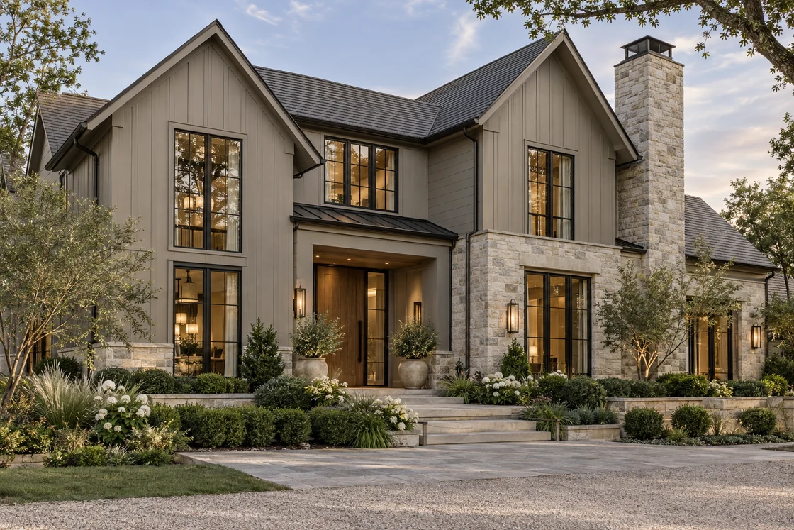
The green-gray reference home shows how this direction can work. Pale stone defines the chimney and lower walls, while quieter siding carries the gables. Dark window frames provide definition and the recessed wood entrance adds warmth.
For your own palette, test Chatroom alongside the existing roof and masonry first. Warm limestone, a restrained off-white trim and medium-toned timber are combinations worth exploring. If the stone has strong pink or yellow variation, check the samples together before assuming the neutral will suit it.
SW 7602 Indigo Batik: Rich Blue With Architectural Presence
Indigo Batik is a deep, saturated denim blue. It gives homeowners a darker exterior option with more visible color than a straightforward black or charcoal.
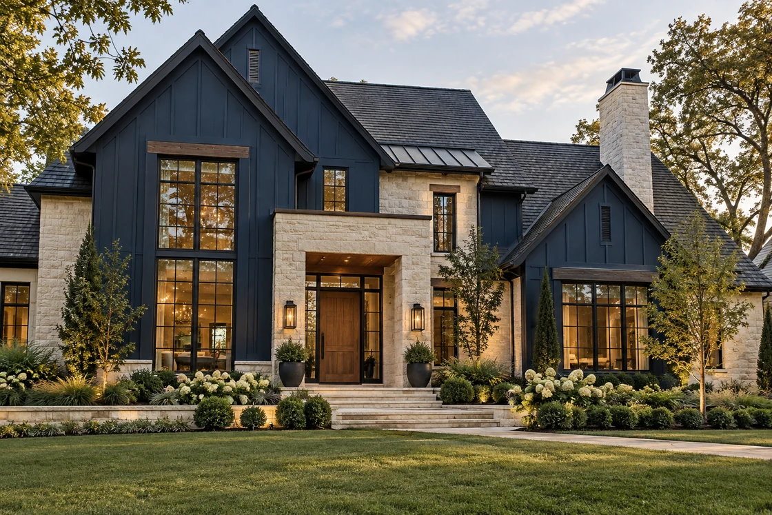
The blue reference image uses pale stone to break up the darker walls. Timber details and a natural wood door bring warmth to the composition, while the blue gables make the roof forms easy to read.
This approach can suit coastal, New England-inspired, Craftsman and transitional architecture. On a house with a large, visible roof, however, the roofing color needs to remain part of the decision. A cool blue wall and a strongly warm roof may require a different trim or masonry balance.
You do not need to use Indigo Batik on every wall. It can also define a gable, selected siding volume, shutters or a front door. Choose the application based on the house’s proportions, then keep the surrounding palette relatively quiet.
Read more about choosing exterior colors for a black roof
SW 7040 Smokehouse: Earthy Depth Beyond Charcoal
Smokehouse is a warm brown with a prominent gray undertone. I would explore it when a darker exterior needs to feel grounded, particularly beside natural stone, timber and mature planting.
Its brown foundation makes it a useful alternative to black, navy or a cooler charcoal. It can support a tonal scheme with lighter taupe walls or trim, rather than relying on stark white outlines around every opening.
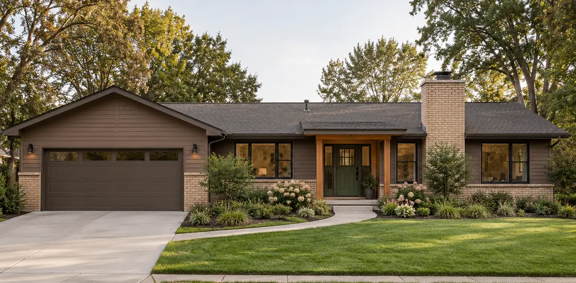
The brown-toned ranch illustration shows the wider palette principle: coordinated siding and garage, pale brick and a timber-framed entrance. The dark green door adds a restrained accent. This is not a verified Smokehouse paint example; a Smokehouse-based version still needs samples checked against the actual masonry and roofing.
Consider using the deeper color on siding, a garage or selected accents, depending on what should recede. A coordinated garage finish can help the entrance remain the focal point. Here, timber posts and a walkway define the entrance without a bright garage or several competing trim colors.
See how garage door color changes the balance of an exterior
SW 7009 Pearly White: A Nuanced Light Exterior
Pearly White offers a softer-looking white direction, but it should not be treated as a universally warm cream. Sherwin-Williams identifies gray undertones, so its appearance needs to be checked against the materials on your particular home.
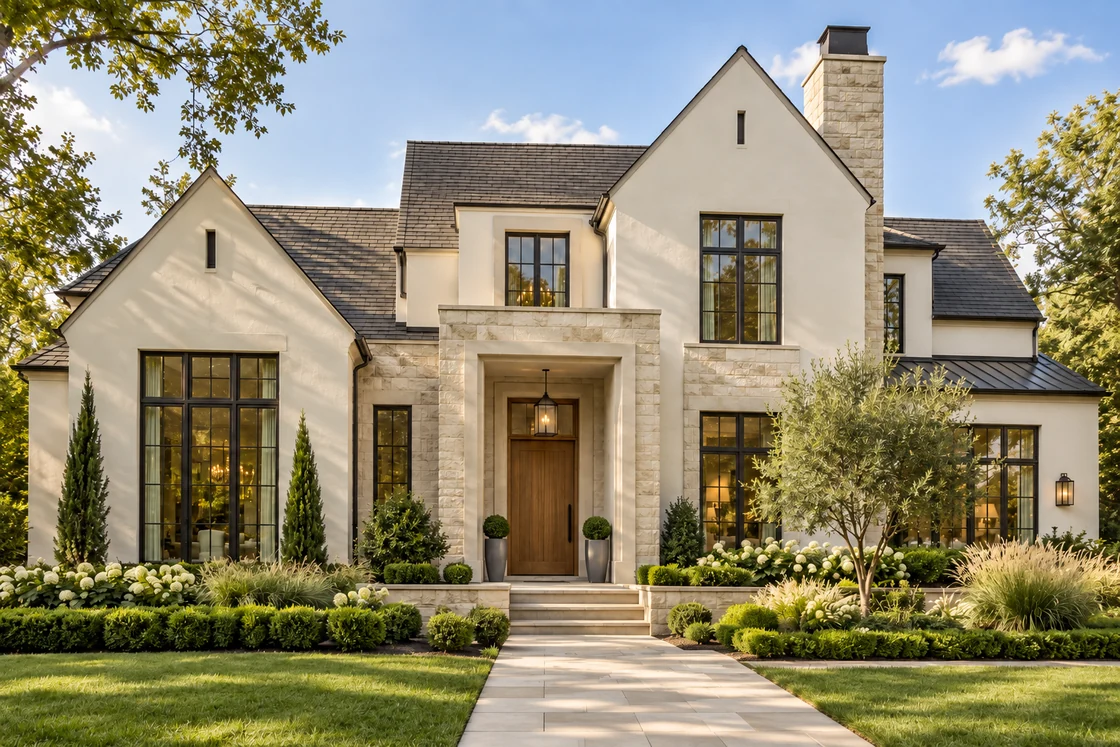
The light exterior shown at the top of this article combines pale stucco, limestone, a wood door and dark window frames. Those surrounding materials create much of the warmth. Choosing a white solely from the appearance of a sunlit photograph can miss that relationship.
I would test Pearly White for a transitional, coastal or updated traditional home where the goal is brightness with quieter contrast. Compare it beside the stone in both sunlight and shade. A white that looks gentle alone can appear cooler, brighter or grayer next to another finish.
Let the entrance, texture and planting supply interest. You do not need a contrasting trim color on every detail to make a light exterior feel architectural.
The Palette Matters More Than the Trend
These four colors cover very different moods: Chatroom offers a green-influenced neutral, Indigo Batik brings blue depth, Smokehouse introduces earthy brown and Pearly White creates a lighter background.
What connects them is the opportunity to build a complete palette. Start with the permanent roof, brick, stone and window finishes. Then decide which surfaces should lead, which should sit quietly behind them and where a single accent will be most useful.
On an older house, a simpler palette can often do more than another decorative material. A siding color related to the masonry, a better-defined entrance and a coordinated garage finish may provide a clearer transformation than several competing accents.
For 2027, my preference is for colors chosen around the architecture and setting. A trend can introduce possibilities; the house should determine the final combination.
How to Test Your Exterior Color Shortlist
Compare physical samples outside beside the roof, masonry and trim that will remain. View them in morning light, afternoon light and shade. Avoid making the decision from a phone screen or a small indoor chip alone.
Test the same group on a sunlit elevation and beneath deeper eaves. Strong daylight can make a dark wall look lighter and a pale wall brighter; shade can reveal a different undertone. View the samples from the street as well as close up, and compare the siding with the roof that will sit above it.
Paint a larger movable sample board, using the intended coating where appropriate, so you can test more than one wall. Place trim and door samples next to it. Review a roofing or stone sample in the same group if those materials will change.
Check the proposed coating and color with the siding manufacturer or your painter before ordering, particularly for darker finishes. Material compatibility and installation requirements need local confirmation.
A visualization helps you judge the distribution of color across your house: whether a dark gable feels balanced, a garage attracts too much attention or a light entry has enough definition. It complements sample testing rather than replacing it.
Choose the Direction That Suits Your Home
If you prefer a subtle connection to the landscape, begin by testing Chatroom. If you want richer visible color, explore Indigo Batik. For an earthy darker scheme, compare Smokehouse with the existing masonry. If you want a lighter exterior, test Pearly White alongside the roof and stone before settling on the trim.
The strongest choice is the one that improves your actual home. Consider the full view, including doors, windows, lighting and planting, before committing to materials or paint.
Exterior Color Questions, Answered
What is Sherwin-Williams’ 2027 Color of the Year?
Celery SW 6421 is the official 2027 Color of the Year. It is a soft herbal green with yellow undertones, listed for interior use rather than exterior application. Chatroom, Indigo Batik, Smokehouse and Pearly White are my separate exterior selections, not Color of the Year winners.
Which 2027 Sherwin-Williams colors work well for house exteriors?
There is no universal exterior choice. From the official forecast, I would sample White Duck for a light direction, Roycroft Bronze Green for deeper accents. Celery is listed for interior use and should not be specified outside. For the four independent selections here, use the comparison above to narrow the role and architectural fit.
How do I choose an exterior color that complements existing brick and roofing?
Start with the roof, brick, stone, mortar and window finishes that will stay. Compare large paint samples directly beside those materials on more than one elevation. Check sunlight and shade before choosing trim or adding a door accent.
Should I follow exterior color trends or choose timeless colors?
Use a trend to discover possibilities, then let the house decide. A palette that respects the architecture, permanent materials and setting is a more useful long-term starting point than a popular color considered on its own.
Further reading
Sherwin-Williams: Rewild Colormix Forecast 2027
Sherwin-Williams: Celery SW 6421, 2027 Color of the Year
Sherwin-Williams: Rewild design stories and Continuity Colors
Sherwin-Williams: Chatroom SW 6171
Sherwin-Williams: Indigo Batik SW 7602
Sherwin-Williams: Smokehouse SW 7040