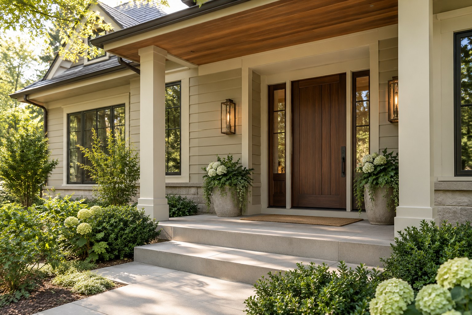
One Builder-Beige House, Three Exterior Design Directions
A warm transitional palette, a muted organic palette, and a deeper blue-green direction reveal different possibilities within the same architecture.
What is worth keeping?
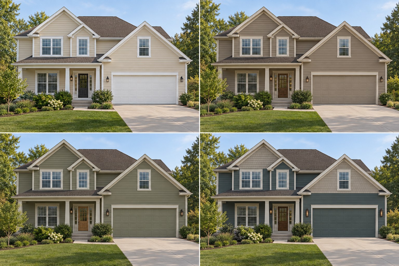
The starting point is an early-2000s suburban house with gabled forms, an attached garage, and a recessed entrance. It borrows from traditional residential architecture without being a strict example of a single historic style. Its proportions are workable. The main problem is a finish scheme that gives the garage and trim more emphasis than the entrance.
In this illustrative study, I would retain the roof form, window locations, entry opening, and garage placement. That keeps the design focused on changes a homeowner can understand: wall color, trim contrast, door finishes, lighting, and the relationship between the upper gables and the main exterior. Each direction answers those questions differently.
Before: a collection of ordinary decisions
The original beige walls are not inherently wrong. They become flat beside bright white garage doors, a basic entrance, and small dark fixtures. White appears wherever trim is available, so the exterior has plenty of outlines but little hierarchy. The most prominent door is the one for the cars.
I would avoid solving this by assigning a new material to every gable. The house already has changes in roof shape and wall plane. It needs those forms to feel related, not more surfaces competing for attention. The three proposals share this restraint even though their palettes differ.
Direction 1: Warm Transitional
Mushroom siding provides a warmer, more dimensional neutral than the original yellow-beige. Its gray-brown character relates to the charcoal-brown roof without trying to match it. Soft ivory trim gives the windows definition while avoiding the sharp contrast of the original white.
Garage doors close to the body color become part of the larger wall composition. Walnut at the front door provides controlled depth and warmth. Bronze lighting belongs with both the wood and the roof, while a warm entrance soffit adds a material accent where someone actually approaches the house. I would choose this direction for a homeowner who wants a quieter update with visible warmth.
Direction 2: Muted Organic
Desaturated sage shifts the house toward its garden. The gray in the green keeps the walls from reading like a bright landscape color, while the softer limestone trim supplies light without a strong white outline. The roof remains the darker anchor above the exterior.
Oak at the entrance brings a lighter wood note than the walnut used in the first proposal. Dark bronze fixtures provide small, useful points of definition. This is not a reason to add foliage everywhere: the planting should reveal the entry and allow the siding color to remain readable. I would test the sage carefully on shaded walls, where some samples can appear cooler or duller than expected.
Direction 3: Deep Sophisticated
A muted blue-green slate gives the main walls more depth. Warm stone-taupe on selected gables keeps the upper forms from becoming one dark mass. The temperature difference creates interest, but both colors are restrained enough to belong in the same palette.
Ivory trim is used selectively to keep the openings readable. The garage remains related to the main siding, and a dark walnut door introduces warmth rather than another bright color. Elongated bronze lighting suits the taller entrance treatment, provided the actual mounting space supports its scale. This direction has the strongest personality, so it needs the most careful checking against roof, windows, and daylight.
How I would choose between them
I would start with the finishes that cannot change, the homeowner’s preferred level of contrast, and the light at the property. A palette that feels calm in a sunny concept image may be much darker under deep tree shade. White window frames may also limit how far the trim can move toward warm cream.
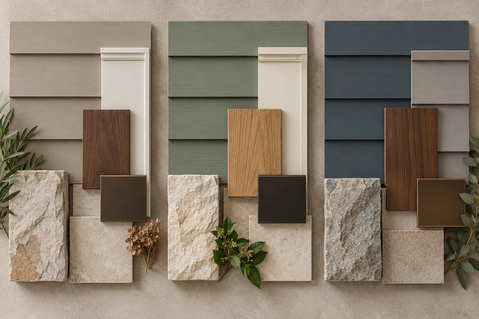
The material study below makes the differences easier to compare: warmer neutral and walnut, softer green and oak, or deeper mineral color and taupe. These are complete relationships, not three unrelated wall colors. The best choice is the direction that remains convincing when you place its samples beside the actual roof and windows.
Turn the direction into a practical scope
A final proposal should specify where each finish goes, which products support the entrance, and what needs local verification. Lighting clearances, door dimensions, surface preparation, and material suitability should be checked before ordering. A rendering helps you see the choices together; it does not replace installation details.
You can also phase the work. Resolve the main palette and garage treatment first, then coordinate the entry door, fixtures, and soffit details as the budget allows. Keeping the intended relationships clear helps each phase look deliberate rather than like another disconnected update.